
Hover animations
Micro-interactions on cards, buttons, and links.
CSS-only animated gradient background and glowing border on hover, two color variants, licensed MIT. Good as a single hero or pricing-page primary CTA, using it for every button on a page dilutes the effect and slows scanning. The GradientButton implementation itself is not shown, only this usage wrapper.
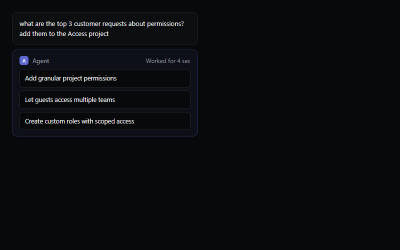
Shows a user prompt, a brief working state, then the agent's structured output. Timing is fixed at 1.4s here, tie it to a real async call if this pattern ships inside an actual product instead of a marketing page.
Click-to-play video hero, thumbnail scales into a modal player on click. Good for a SaaS or product-demo hero above the fold. Needs an embeddable video URL (YouTube embed format), swap the thumbnail image per client.

Diagonal streaking-light overlay, layer it over a dark hero or a 404/empty-state screen. The number prop controls density, keep it under 20 on mobile or it tanks paint performance.
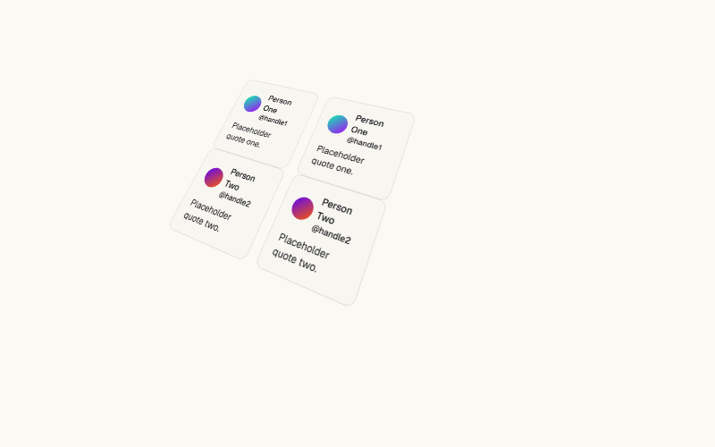
Tilted CSS-perspective wall of marquee columns, high visual impact for a portfolio or agency landing page. Heavier than the flat marquee, test on low-end mobile before shipping. Not for content-dense B2B pages.
Scrambles random characters before settling on the real text, triggers on hover by default or on scroll-into-view with startOnView. Good for a nav label or a small interactive detail, overkill for body copy or long headlines.
Tracks the cursor and paints a soft radial spotlight plus a highlighted border on hover, wraps around any shadcn/ui Card content. Needs next-themes for the dark/light gradient color swap, strip that if the project has no theme provider.
Animated light beams connect icon nodes to a central hub, the standard 'we integrate with your stack' section. Requires wiring up a ref per node, count on light code work to swap the icon set and node count.
A single light beam that continuously travels around a container's border, drop it inside any card or button wrapper with `position: relative` and `overflow: hidden`. Cheap way to signal 'this is the highlighted plan' on a pricing card.
Two concentric rings of icons orbiting a center point at independent speeds and directions, pure CSS keyframes under the hood. Common for a hub-and-spoke integrations section, swap in the client's own logo set.

Continuous light streak travels along the button's rounded border on a dark fill, pure CSS. Good primary CTA for a dark hero section, avoid pairing with more than one other animated element in the same viewport.
Animated conic-gradient border and glow, ships with a solid and an outline variant. High-attention CTA, best reserved for a single pricing page's featured plan rather than every button on a site.
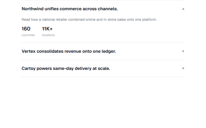
Accordion of case-study rows, only one open at a time, each reveals two stat chips on expand. Good for a customer-proof section without full case study pages. Replace the stat numbers and copy with the client's real, verifiable figures only.
Draws the eye to the button after the hero settles: soft ring expands and fades, button bumps 4% in size. One breath, then quiet.
Same trick, but paused when the mouse is over it — lets people actually read the items. One CSS rule, no JS.
Link underline sweeps in from the left on hover. Nav uses this pattern on nav items — one of those details you notice only when it's not there.
Solid button where a darker fill slides in from the left on hover, and the arrow nudges. Snappier than a plain opacity hover, and it survives on dark backgrounds. Nav's primary CTA.
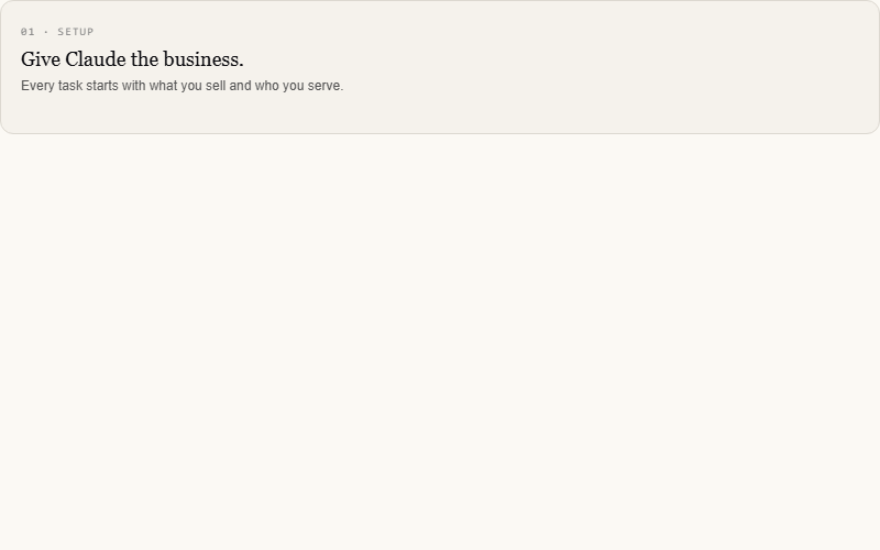
Cards tilt toward the cursor's X/Y and a soft glow follows underneath. Nav uses it on feature cards. Pointer-fine only — pass the media query so touch devices get a flat card.
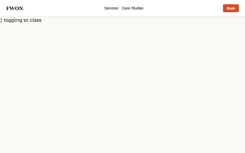
Nav bar tightens up and gains a soft shadow once the page has scrolled past ~40px. Nav toggles a `.sc` class via a scroll listener. Preview loops the state every 2s so you see both. Real usage: throttle the scroll handler or use IntersectionObserver on a hero sentinel.
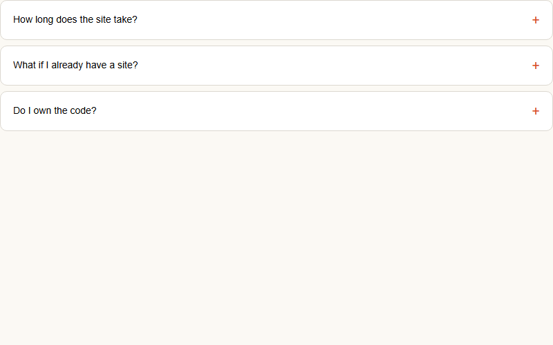
Nav's /faq pattern: click the row, plus icon rotates 45deg (becomes X), answer transitions its max-height open. One-at-a-time (radio-style) — opening one closes any other. max-height is the pragmatic trick: `height: auto` can't transition.
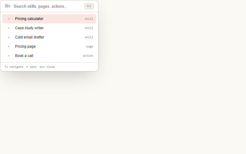
Ships-with-modern-site UX: ⌘K opens a search-first launcher, type to filter results, arrow keys to navigate, enter to jump. Use for skill libraries, product catalogs, docs. Preview auto-types a query so you see the filter kick in.
Mobile conversion staple: primary CTA is IN the hero, then a sticky bar slides in from the bottom once the hero exits. Nav toggles it via IntersectionObserver on the hero. In the preview it slides in after a delay to show the arrival.
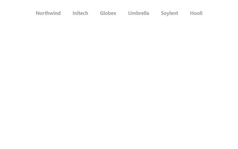
Dimmed, grayscale wordmarks that sharpen to full opacity on hover. Use real client logos as SVGs rather than text once available; keep it to 5-7 marks so the row does not wrap awkwardly.
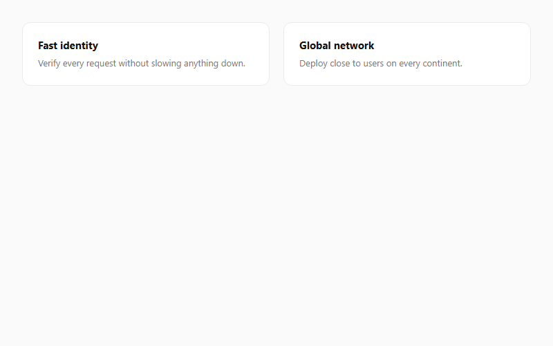
A blurred two-tone gradient sits offscreen inside each card and fades in on hover using mix-blend-mode. Subtle at low opacity; push past .5 and it starts looking like a colored highlight instead of a glow.
Want your site’s hover animations to look this good?
We build full sites with blocks like these.