Text animations
Line-mask reveals, word rise, character cascades, typewriters, decrypt effects.
Load-triggered reveal, each word blurs in on a stagger. Re-trigger on route change by toggling a class rather than replaying automatically, replaying every scroll gets annoying fast.
Character, word, or line-level reveal with a dozen animation presets (blurInUp, slideUp, scaleUp, etc). Use `once` so it does not replay on every scroll re-entry. Good default for section headlines, avoid stacking more than one per screen.
Classic character-by-character typewriter effect with a blinking cursor, supports looping through multiple phrases. Works well for a rotating value-prop line under a hero headline. Keep phrases short, long strings make the loop feel slow.
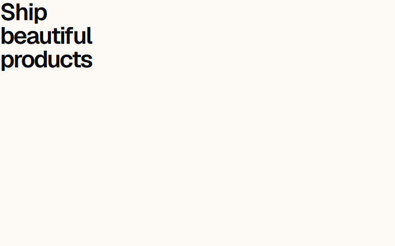
Wraps one word in a shifting multicolor gradient to draw the eye in a hero headline. Pass a custom `colors` array to match brand palette instead of the default rainbow. Use on one word max per headline, more reads as noisy.
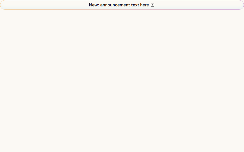
Small rounded pill with a slow-moving gradient border, standard pattern for a 'what's new' announcement above a hero headline. Pairs naturally with a chevron icon and a link to a changelog or release note.
Scrambles random characters before settling on the real text, triggers on hover by default or on scroll-into-view with startOnView. Good for a nav label or a small interactive detail, overkill for body copy or long headlines.
Vertically swaps one word at a time inside a fixed headline, common for '[Verb] your business [rotating word]' hero patterns. Keep words the same rough length so layout does not jump between swaps.
Continuous small star sparkles appear and fade around the text, best used sparingly on one badge-like word (e.g. 'Featured', 'New'). Pass a `colors` object to match the sparkle color to brand accent.
Liquid letter-morph transition between words in a fixed sequence, more fluid than a hard swap like Word Rotate. Reads as premium/techy, good for a SaaS hero, skip for a local-service business site.
Pins the section and fades in words one by one as the user scrolls past it, a common long-scroll storytelling pattern. Needs enough vertical scroll room to breathe, do not use inside a short section.
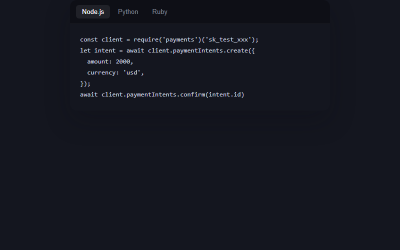
Dark code card with a language tab switcher, the code types itself in on load and on tab change with a blinking caret, no syntax highlighter dependency, just monospace color and a caret pseudo-element. Great for a developer-facing product page, skip it entirely for local-business or non-technical clients.
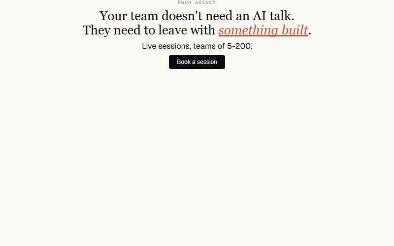
Nav's full opener: eyebrow rises, headline lines lift out of masks, orange sweep lands under the emphasis word, sub fades in, CTA cascades, ring pulses. One choreography, ~2.5s.
Nav's headline signature, ported without SplitText. Each line sits inside its own overflow-hidden mask; a 15-line vanilla splitter measures wraps at layout time so it survives resize.
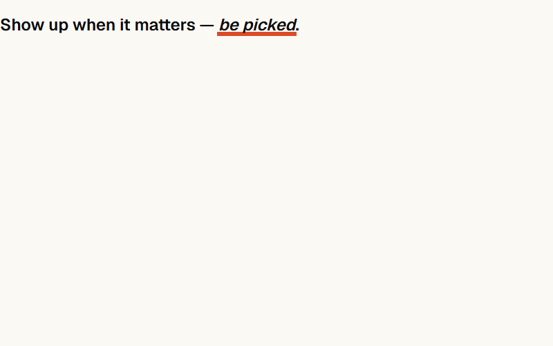
Orange bar sweeps under a keyword to punctuate a headline. Nav uses it under 'THIS IS THE FIX' — a full-stop for the eye.
Draws the eye to the button after the hero settles: soft ring expands and fades, button bumps 4% in size. One breath, then quiet.
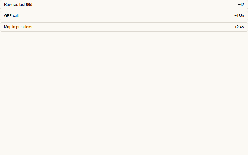
Group of siblings rises together at 60ms offsets. Use it for stat rows, feature grids, list items entering on scroll.
Each word fades in and lifts 14px, 60ms apart. Softer than line-mask — good for body-copy leads and sub-heads.
Every letter rises 12px with a tiny rotation, 25ms apart. Reserve for short headings (5-8 words max) — it gets busy fast.
Words come from blur(12px). Feels cinematic without much travel. Cheap on the compositor if you keep the blur below 16px.
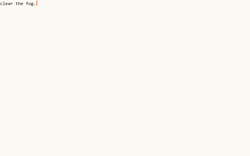
Types out one character per ~50ms with a blinking bar. Slow-feeling — use only when the effect itself IS the moment (product name reveal, hero code sample).
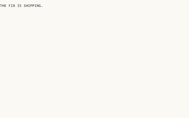
Characters shuffle through random glyphs, then land. Great for numbers, product codes, dashboard headers. Locks left-to-right by default.
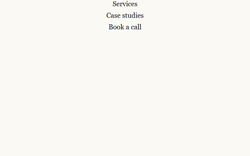
Link underline sweeps in from the left on hover. Nav uses this pattern on nav items — one of those details you notice only when it's not there.
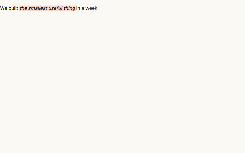
A soft translucent bar sweeps behind a phrase, like a yellow marker. Slower and softer than the sweep-highlight bar — good inside body copy.
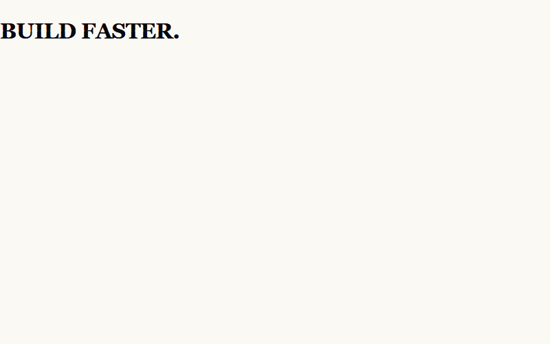
RGB-split with a stuttering clip. Reserve for one moment — logo reveal, 404 page, a single H1. Any more and it reads as broken.
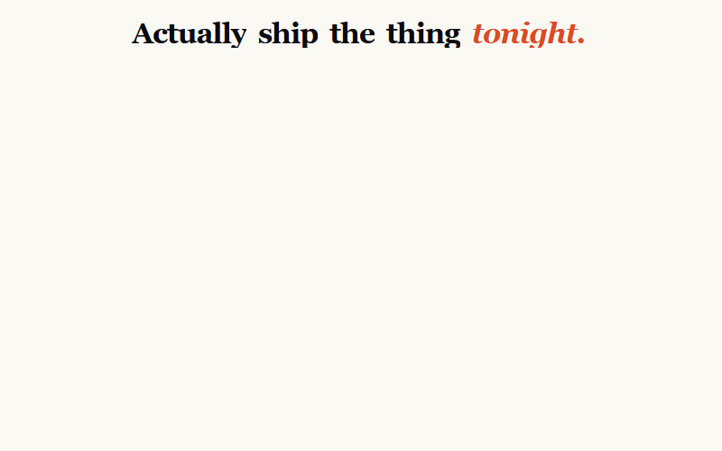
Words rise out of masks with a 40deg X-axis rotation — more cinematic than a flat lift. Nav uses this for the /yeg hero H1. Give it perspective on the parent or the rotation looks flat.
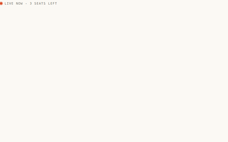
The 'live now / just shipped' dot. One CSS keyframe. Nav uses it on eyebrows and inside the prompt-receipt header. Best paired with a monospace uppercase label — it inherits the pulse the eye reads as 'active.'
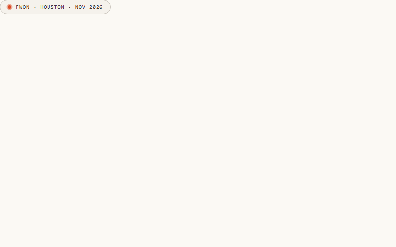
Chip 23 + a pill wrapper. Slot for status labels above the H1 ('Claude 101 · Edmonton · Sept 17') or category tags. Nav's exact eyebrow pattern.
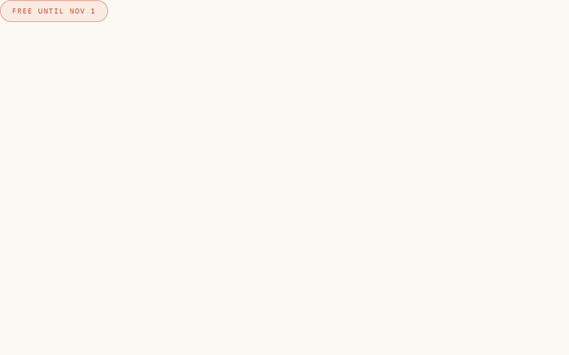
Border color oscillates between two accent tints on a 3s ease-in-out. Perfect for an eyebrow that should catch a scanning eye without motion in position — feels 'alive' without moving.
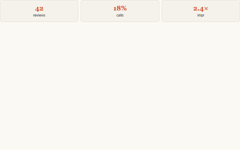
Cards scale from .92 to 1 with a fade — softer than a Y-lift because there's no vertical travel. Nav's default on stat tiles and score cards. Good for image grids where an upward push would shove things around.
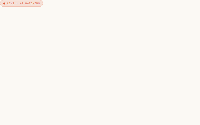
Different from ping (card 23): this pulses opacity + scale together instead of expanding a shadow ring. Softer, slower — 'live now' rather than 'just shipped'. Nav uses it on the /live seat-count chip.
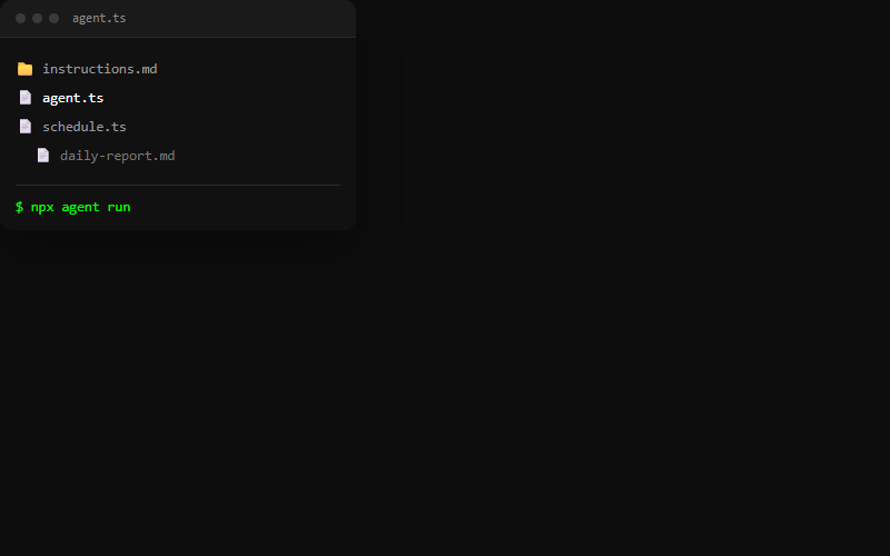
Dark editor-style card: window chrome dots, a mock file tree, and a terminal line that types a command on a loop with a blinking block caret. Good as a floating visual next to feature copy; keep the file list to 3-4 rows so it stays legible at card size.
Want your site’s text animations to look this good?
We build full sites with blocks like these.