
Background patterns
Dot grids, aurora, gradient orbs, meteors — atmospheric layers.

80s-style perspective grid, pure CSS animation, no JS cost. Works well behind a bold gradient headline for a synthwave or gaming-adjacent brand. Skip for conservative/professional-services clients, reads too loud.
SVG dot grid with a radial fade mask, subtle enough to sit behind body copy or a pricing table. The glow prop adds a mouse-follow highlight if you want more motion. Safe default background for any vertical.

Diagonal streaking-light overlay, layer it over a dark hero or a 404/empty-state screen. The number prop controls density, keep it under 20 on mobile or it tanks paint performance.
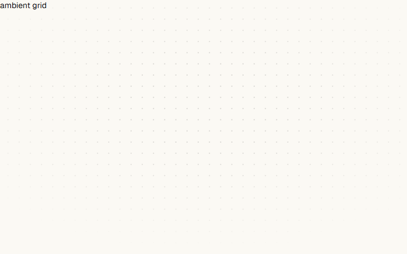
Ambient dot-grid that slowly translates diagonally, softly masked toward the center so it fades at the edges. Nav's hero backdrop. Pure CSS — one background-image + one keyframe.

Two big blurred color orbs that drift and scale on ease-in-out. Warm one top-right, cool one bottom-left. Cheap way to add depth behind a quiet hero without hero imagery.

The product-mockup screenshot in the hero right column that gently bobs up and down. `translateY(0 → -10px)` on 7s ease-in-out, both directions. Enough to feel alive, not enough to distract from the copy on the left.

Soft multi-color radial glow blurred behind a centered geometric mark, flanked by a left headline and a right feature list. Works for any dev-tool or infrastructure product; drop the mark for a plainer B2B SaaS hero.
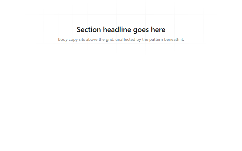
A faint pixel grid faded out via a radial mask so it reads at the edges but disappears behind the centered content. Drop this behind any hero or section divider; adjust background-size to change grid density.
Want your site’s background patterns to look this good?
We build full sites with blocks like these.