
Composed heroes
Full hero compositions assembled from multiple primitives.
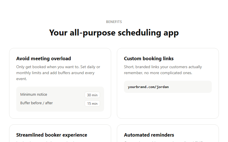
Feature grid where each card carries a tiny illustrative UI snippet instead of a plain icon, makes abstract features feel concrete. Best for product marketing where you have 4 clear, distinct capabilities to show. Swap each mini-mockup for something true to your own UI.
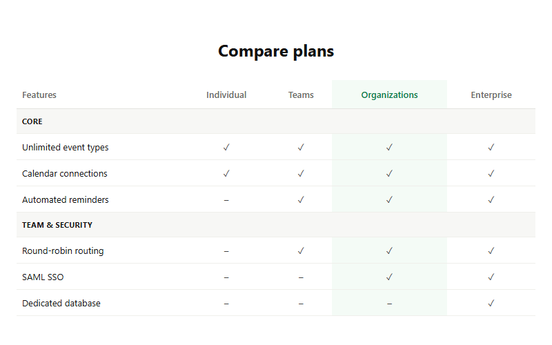
Detailed row-by-row plan comparison for buyers who need to justify the upgrade to a boss or partner. The highlighted column should match whichever plan carries your best margin. Only ship this below a simpler card-based pricing table, never as the sole pricing view.
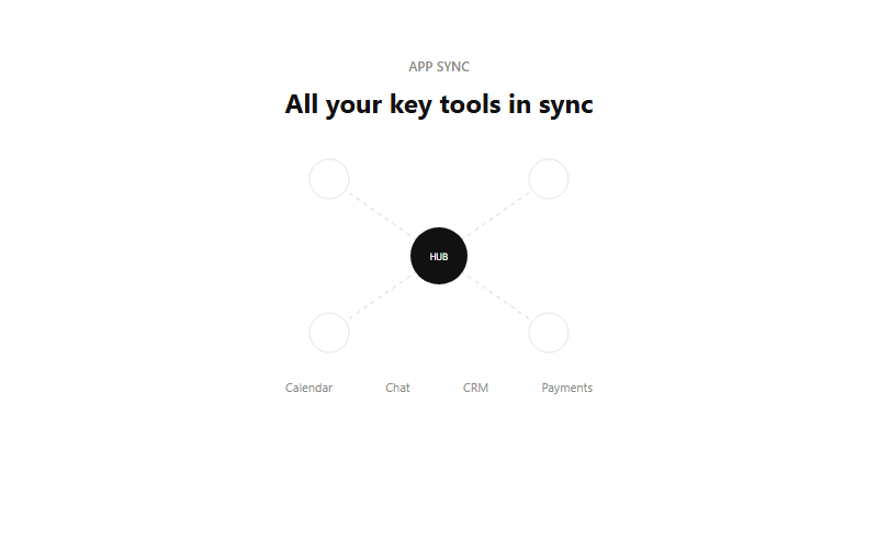
Visual metaphor for 'we connect to everything', a hub node with dashed lines out to satellite app icons. Good directly above or below a logo cloud of actual integration partners. Keep it to 4 satellites max, more than that reads cluttered at small sizes.
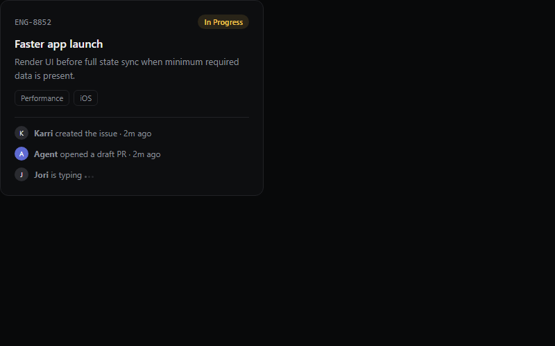
Great for showing product depth on a features page without a real screenshot. The typing-dots row implies a live collaborative tool, drop it if the product has no chat or comments.
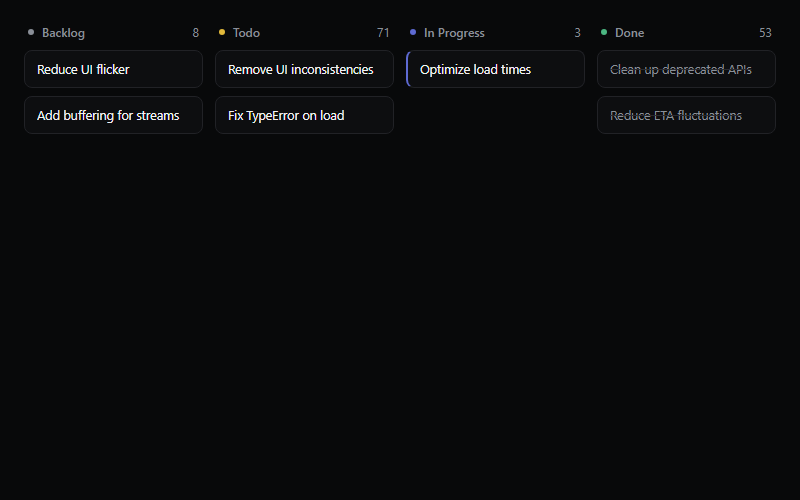
Static kanban illustration for a product/features page, not a real board. Keep to 3-5 items per column so it reads at a glance, more than that looks cluttered at hero scale.
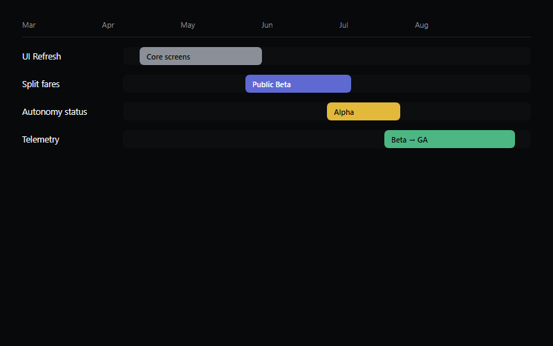
Roadmap/gantt visual for a planning-tool features page. Bar widths are illustrative, wire to real milestone data if this ever leaves marketing and becomes a real product view.
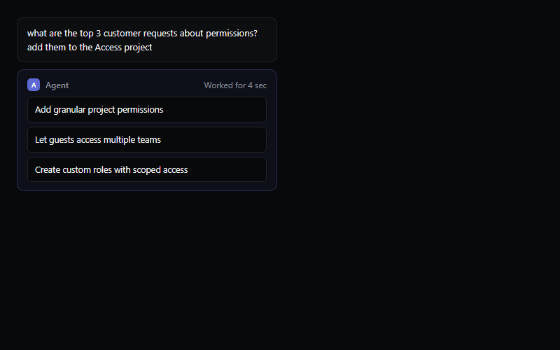
Shows a user prompt, a brief working state, then the agent's structured output. Timing is fixed at 1.4s here, tie it to a real async call if this pattern ships inside an actual product instead of a marketing page.
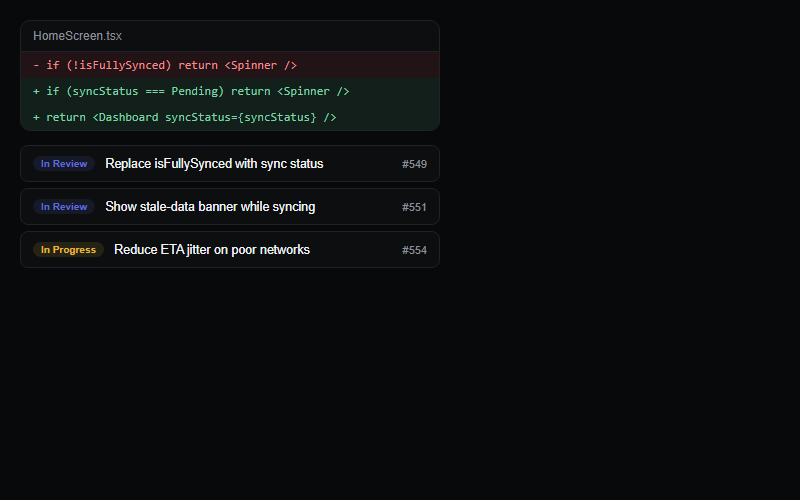
Pairs a code diff with a linked PR list to sell a dev-tool feature. Keep the diff to 2-4 lines, a real full diff breaks the compact card layout.
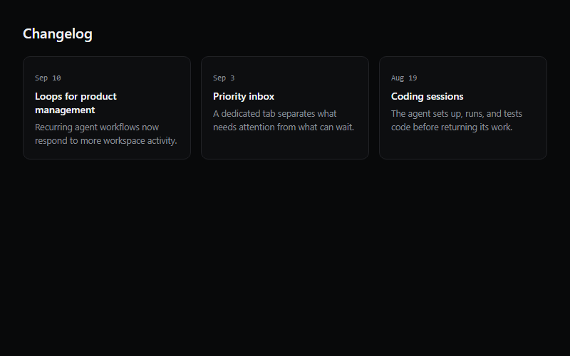
Three-card changelog teaser for a homepage or product page, links out to a full changelog. Hover-lift is the whole interaction, do not add more motion on top of it.
Animated light beams connect icon nodes to a central hub, the standard 'we integrate with your stack' section. Requires wiring up a ref per node, count on light code work to swap the icon set and node count.
Two concentric rings of icons orbiting a center point at independent speeds and directions, pure CSS keyframes under the hood. Common for a hub-and-spoke integrations section, swap in the client's own logo set.
Switches between related content panels in place, no page navigation. Use the default segmented look on dashboards, keep to two or three tabs before it belongs in a sidebar instead.
Short hint text on hover or keyboard focus. Wrap the app root in one TooltipProvider, do not nest a provider per tooltip, and skip tooltips for anything a mobile user needs to read since hover does not exist there.
User or brand image with a text fallback when the image fails to load. Use AvatarGroup (same registry entry) to stack several for team or reviewer lists.
Collapsible sections for FAQs, settings groups, or long-form content. Keep only one item open at a time on marketing pages, allow multiple open on dashboards and settings screens.
Inline banner for page-level warnings or confirmations that should stay visible until the user acts. Use it for form-level errors, not for a transient success message, that belongs in a toast instead.
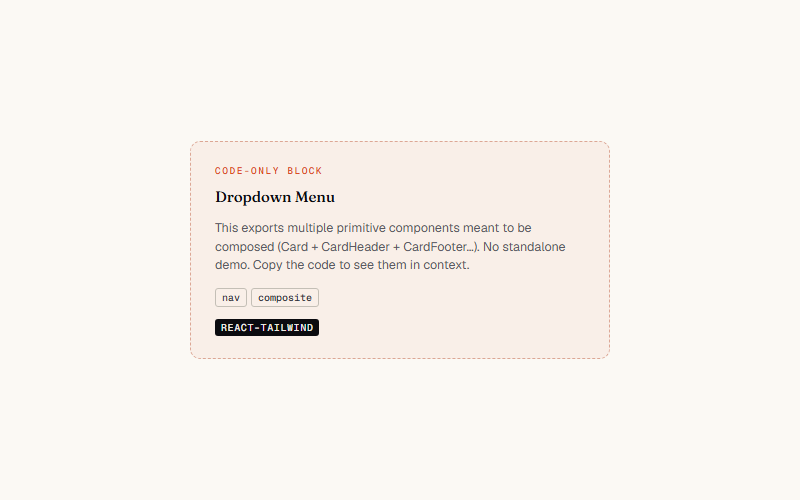
Contextual menu triggered by a button or icon, supports nested submenus and checkbox items. Use it for user menus and row actions, not as a stand-in for primary site navigation.
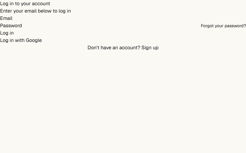
Single-card login form with email and password only. Good default for internal tools where there is no social auth to wire up.

Two-column login with a full-height image on desktop that collapses to a single column on mobile. Swap the placeholder image and company name, the form itself is a separate login-form component pulled from the same source URL.
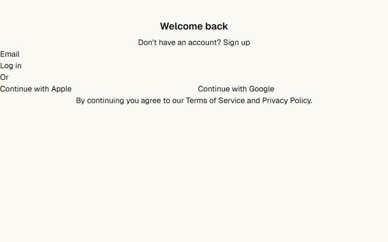
Centered login card built around one email field plus social login buttons and a legal footer. Use it when the client wants one-click sign-in via Google or Apple instead of a password.
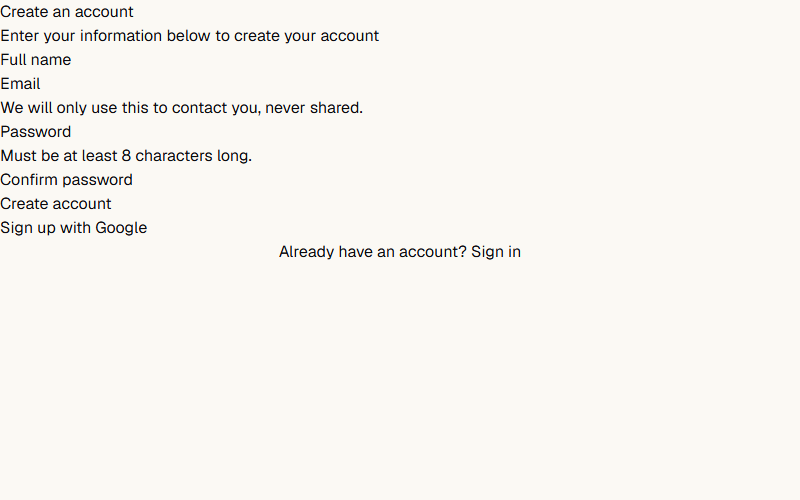
Card-based signup form with name, email, password, and confirm password fields. Swap the field description copy for the client's own password rules and privacy language.
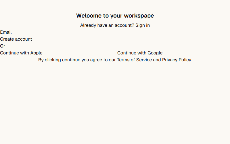
Compact signup form built around one email field with Apple and Google buttons below it. Use for low-friction signups where password creation happens later, after email verification.
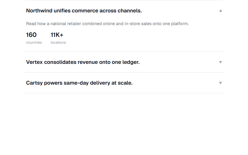
Accordion of case-study rows, only one open at a time, each reveals two stat chips on expand. Good for a customer-proof section without full case study pages. Replace the stat numbers and copy with the client's real, verifiable figures only.
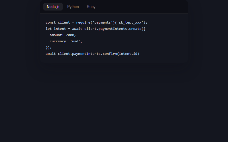
Dark code card with a language tab switcher, the code types itself in on load and on tab change with a blinking caret, no syntax highlighter dependency, just monospace color and a caret pseudo-element. Great for a developer-facing product page, skip it entirely for local-business or non-technical clients.
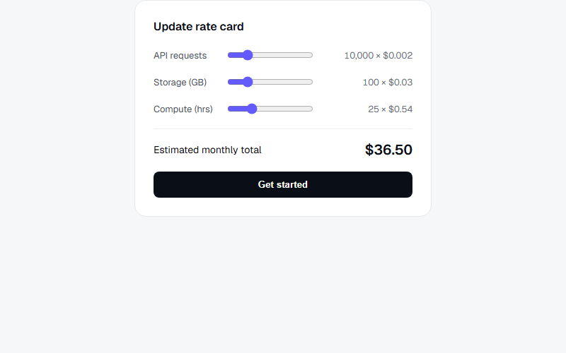
Interactive rate card where dragging each usage slider recalculates the line cost and the monthly total live, mirrors how Stripe visualizes usage-based pricing. Best on a usage-billing or API-product pricing page, overkill for a flat-fee service business.
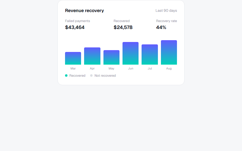
Mini analytics card, bars grow from zero via a CSS custom property once the card scrolls into view, no chart library needed for a simple monthly comparison. Only use this shape when the numbers are real and pulled from the client's own dashboard data.
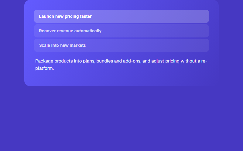
Stacked tab list where clicking an item swaps both the copy panel and the card's background gradient, gives a feature list some motion without a carousel. Limit to three or four tabs, more than that and the background changes feel busy.
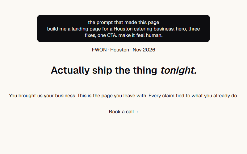
Nav's /yeg opener composed: prompt receipt card up top, ping chip, word flip-in H1 with italic accent word, sub, fill-slide CTA. Sequence: card at 0s, chip .3s, H1 words .5–.85s, sub 1.1s, CTA 1.3s. Scale the type up 40% for real hero use.
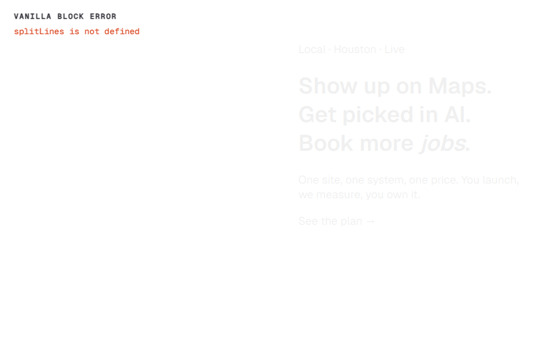
Two-column with orb-blob background: eyebrow chip + line-mask H1 with sweep highlight + sub + CTA on the left, floating dark-mode mockup on the right. Right column hides on narrow — mockup is decoration, copy is the message.
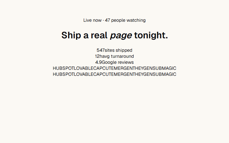
Centered layout: drifting dot-grid background, breathing chip, word-rise H1 with italic accent, stat row, logo cloud at the bottom. Reads as 'social proof at every scale.' Skip the mockup right column, let the type + logos carry it.

A small mocked product screenshot (chat bubble, notification, or status row) sits inside a card above the real heading and description. Use this to make an abstract feature feel concrete without a real screenshot; swap the mock content per feature.
Want your site’s composed heroes to look this good?
We build full sites with blocks like these.