
Hero sections
Full-bleed openers, split heros with mockups, animated headlines. The block your visitor sees first.
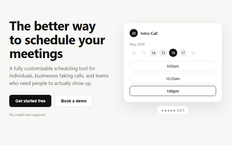
Lead-generation hero for booking or scheduling products: headline plus dual CTA on the left, a live-feeling app mockup on the right. Swap the mockup content for whatever the product actually does; keep the two-button pattern (primary action plus a lower-commitment demo/tour link).
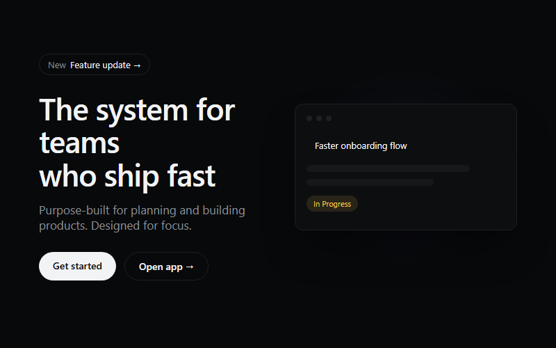
Use for SaaS or product-tool landing pages that need a dark, technical first impression. Skip for warm consumer brands, the near-black ground reads cold.
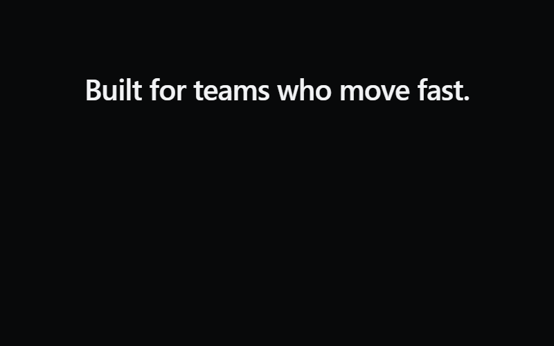
Load-triggered reveal, each word blurs in on a stagger. Re-trigger on route change by toggling a class rather than replaying automatically, replaying every scroll gets annoying fast.
Click-to-play video hero, thumbnail scales into a modal player on click. Good for a SaaS or product-demo hero above the fold. Needs an embeddable video URL (YouTube embed format), swap the thumbnail image per client.

80s-style perspective grid, pure CSS animation, no JS cost. Works well behind a bold gradient headline for a synthwave or gaming-adjacent brand. Skip for conservative/professional-services clients, reads too loud.
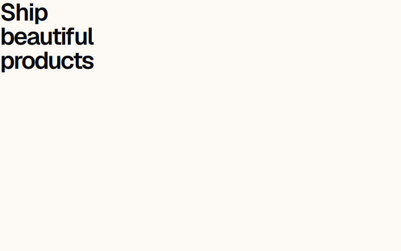
Wraps one word in a shifting multicolor gradient to draw the eye in a hero headline. Pass a custom `colors` array to match brand palette instead of the default rainbow. Use on one word max per headline, more reads as noisy.

Dark gradient hero with three drifting blurred blobs and a small live-updating ticker chip above the headline, the texture Stripe uses to avoid a flat gradient. Swap the ticker for a real metric or delete it, it is decorative only.
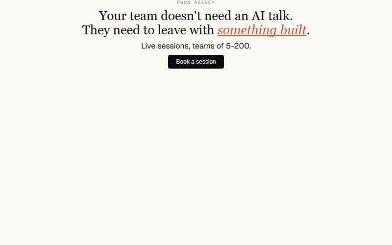
Nav's full opener: eyebrow rises, headline lines lift out of masks, orange sweep lands under the emphasis word, sub fades in, CTA cascades, ring pulses. One choreography, ~2.5s.

Nav's 'silk-band' — a slow warm blur behind the hero that drifts on scroll. Purely atmospheric. Skip unless the hero is quiet enough to notice.
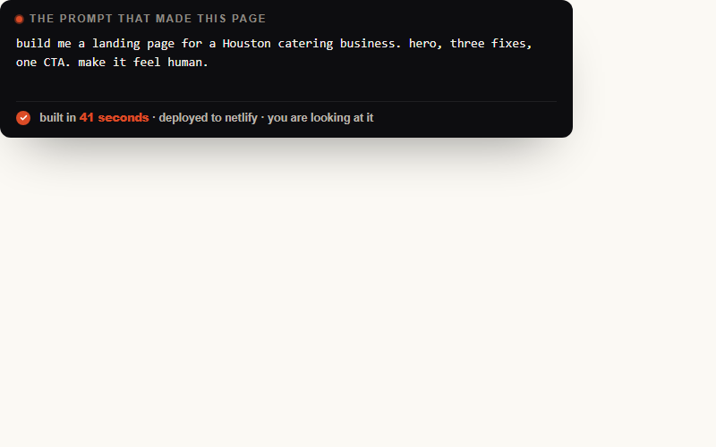
Nav's centerpiece on /yeg. Dark card, ping-dot label, monospace typewriter body, orange tick + result appears after typing settles. Reads as 'this thing was just built' — perfect for FWON's own site or a demo.
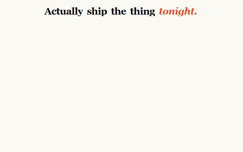
Words rise out of masks with a 40deg X-axis rotation — more cinematic than a flat lift. Nav uses this for the /yeg hero H1. Give it perspective on the parent or the rotation looks flat.
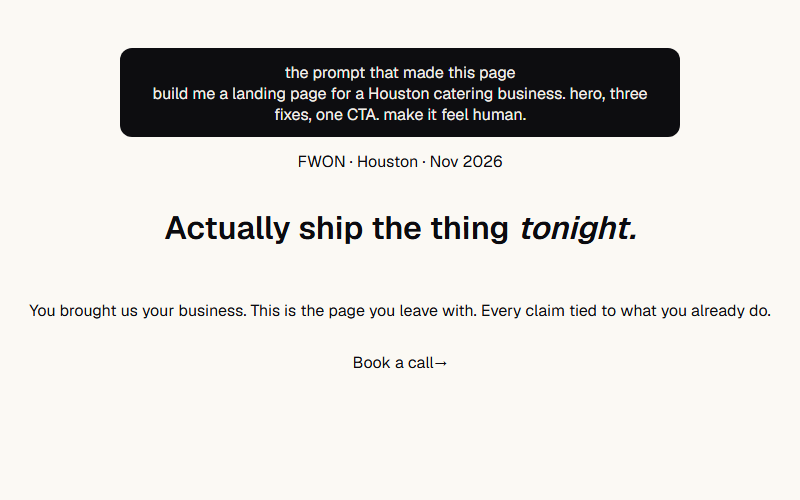
Nav's /yeg opener composed: prompt receipt card up top, ping chip, word flip-in H1 with italic accent word, sub, fill-slide CTA. Sequence: card at 0s, chip .3s, H1 words .5–.85s, sub 1.1s, CTA 1.3s. Scale the type up 40% for real hero use.
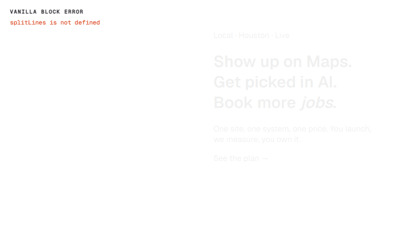
Two-column with orb-blob background: eyebrow chip + line-mask H1 with sweep highlight + sub + CTA on the left, floating dark-mode mockup on the right. Right column hides on narrow — mockup is decoration, copy is the message.
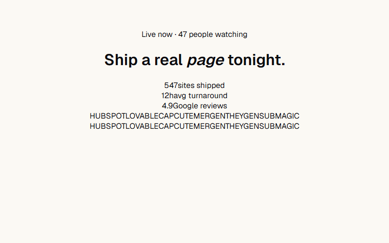
Centered layout: drifting dot-grid background, breathing chip, word-rise H1 with italic accent, stat row, logo cloud at the bottom. Reads as 'social proof at every scale.' Skip the mockup right column, let the type + logos carry it.
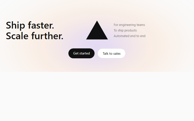
Soft multi-color radial glow blurred behind a centered geometric mark, flanked by a left headline and a right feature list. Works for any dev-tool or infrastructure product; drop the mark for a plainer B2B SaaS hero.
Want your site’s hero sections to look this good?
We build full sites with blocks like these.