
Pricing tables
Tiered pricing cards, feature-comparison tables, calculator widgets.
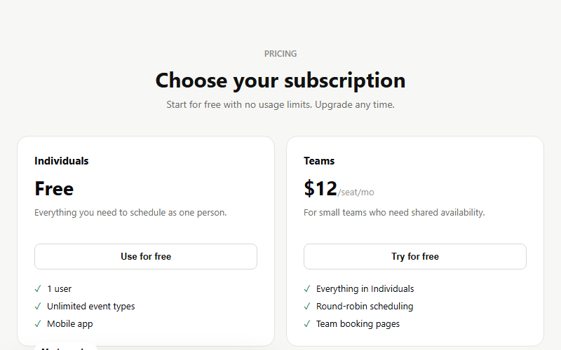
Four-column pricing where the target plan is visually lifted and inverted to dark, drawing the eye without needing a giant arrow or callout. Works for any SaaS or service with a good/better/best/custom ladder. Keep exactly one card featured, two dilutes the effect.
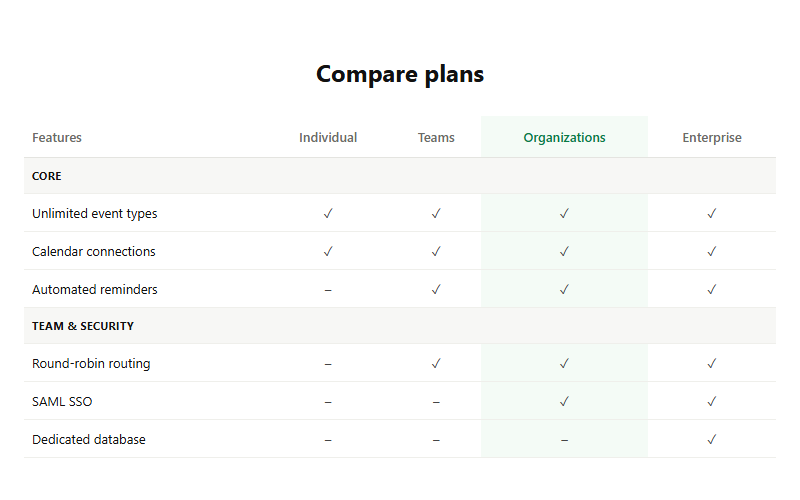
Detailed row-by-row plan comparison for buyers who need to justify the upgrade to a boss or partner. The highlighted column should match whichever plan carries your best margin. Only ship this below a simpler card-based pricing table, never as the sole pricing view.
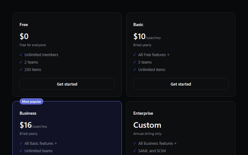
Four-tier table with one highlighted plan, tag placed on the top border like a floating label. Reads best with 3-6 bullets per tier, more and the cards go uneven height.

Three pricing cards where the middle plan is visually elevated with a floating badge and a colored border instead of a filled background, reads as recommended without shouting. Keep exactly one featured card, two looks indecisive.
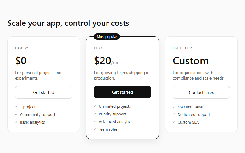
Three flat pricing cards with the middle tier raised by a border, shadow, and a floating 'Most popular' tag. Keep feature lists to 3-5 lines per tier so the cards stay the same visual weight.
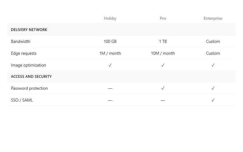
Long-form feature comparison table grouped by category rows, with checkmark or dash cells per plan. Pair with the pricing-tier cards above the fold; this table is for the buyer who scrolls to verify a specific line item.
Want your site’s pricing tables to look this good?
We build full sites with blocks like these.