
Badge
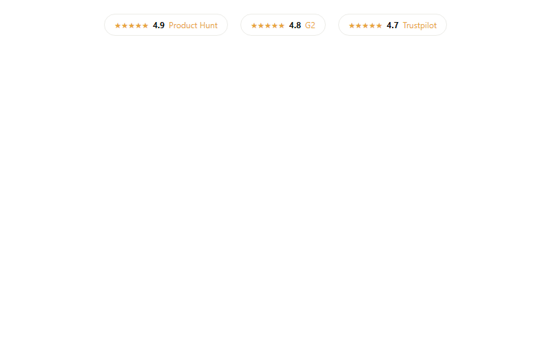
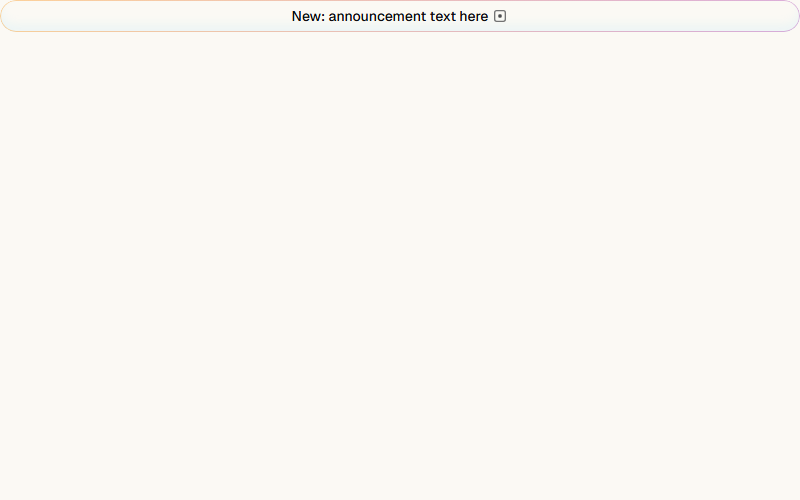
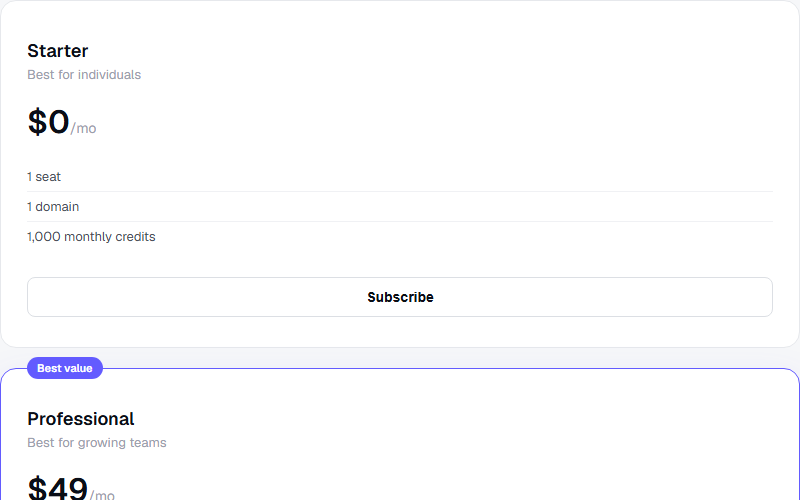
Small status or count label inline with text or in a card corner. Do not use it for anything clickable, reach for Button size sm instead.
Live preview
open in new tab ↗import * as React from "react"
import { cva, type VariantProps } from "class-variance-authority"
import { cn } from "@/lib/utils"
import { Slot } from "radix-ui"
const badgeVariants = cva(
"inline-flex w-fit shrink-0 items-center justify-center gap-1 overflow-hidden rounded-full border border-transparent px-2 py-0.5 text-xs font-medium whitespace-nowrap",
{
variants: {
variant: {
default: "bg-primary text-primary-foreground",
secondary: "bg-secondary text-secondary-foreground",
destructive: "bg-destructive text-white",
outline: "border-border text-foreground",
},
},
defaultVariants: { variant: "default" },
}
)
function Badge({ className, variant = "default", asChild = false, ...props }) {
const Comp = asChild ? Slot.Root : "span"
return <Comp data-slot="badge" className={cn(badgeVariants({ variant }), className)} {...props} />
}
export { Badge, badgeVariants }Block id: shadcn-badgereact-tailwind · drop-in
More badge blocks
Want the whole site, not just the block?
We ship real client sites in 3 weeks — with blocks like this one, wired to your brand.