
Cal.com patterns
Booking-flow patterns from Cal.com.
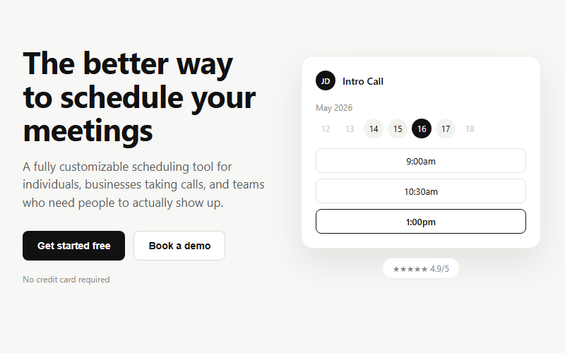
Lead-generation hero for booking or scheduling products: headline plus dual CTA on the left, a live-feeling app mockup on the right. Swap the mockup content for whatever the product actually does; keep the two-button pattern (primary action plus a lower-commitment demo/tour link).
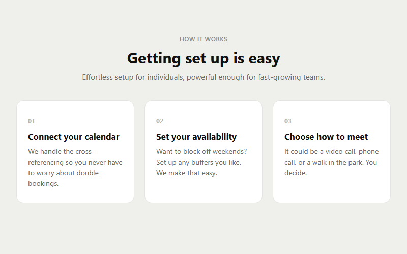
Onboarding explainer for any three-step process (setup, workflow, purchase flow). Works well right under a hero. Replace the step copy but keep the numbered-card rhythm, it reads as fast and low-effort to a visitor.
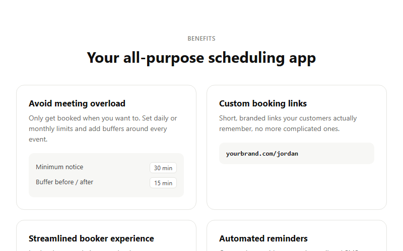
Feature grid where each card carries a tiny illustrative UI snippet instead of a plain icon, makes abstract features feel concrete. Best for product marketing where you have 4 clear, distinct capabilities to show. Swap each mini-mockup for something true to your own UI.
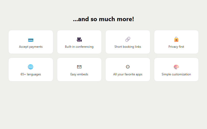
Catch-all grid for secondary features that do not deserve full cards, e.g. security, languages, integrations, small differentiators. Drop this after the main feature grid so the page does not feel like it stopped selling too early.
Neutral social-proof strip for right under the hero. Use real client wordmarks once you have permission to display them; grayscale keeps them from competing with your own brand color.
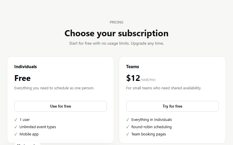
Four-column pricing where the target plan is visually lifted and inverted to dark, drawing the eye without needing a giant arrow or callout. Works for any SaaS or service with a good/better/best/custom ladder. Keep exactly one card featured, two dilutes the effect.
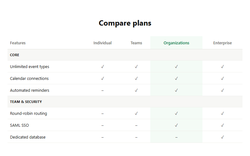
Detailed row-by-row plan comparison for buyers who need to justify the upgrade to a boss or partner. The highlighted column should match whichever plan carries your best margin. Only ship this below a simpler card-based pricing table, never as the sole pricing view.
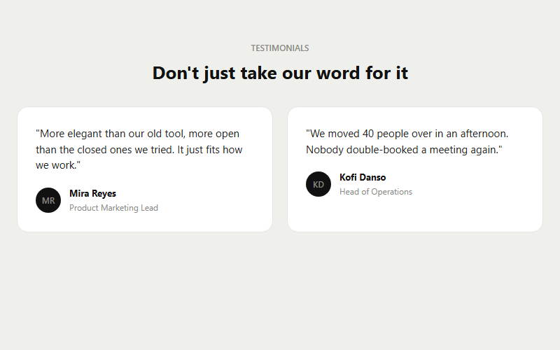
Two-card testimonial layout using initials avatars instead of photos, useful when you do not have signed photo releases yet. Swap in real headshots later without touching the layout. Keep quotes under 160 characters or the cards get uneven.
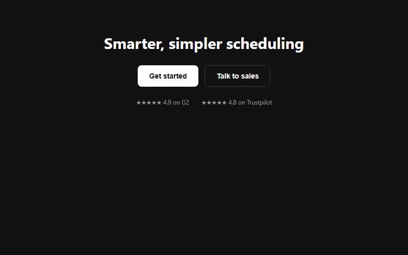
End-of-page closing banner, dark background to signal 'last stop' after a long light-background page. Pair a strong primary action with a lower-friction alternative (sales call, demo) so both self-serve and enterprise visitors have a next step.
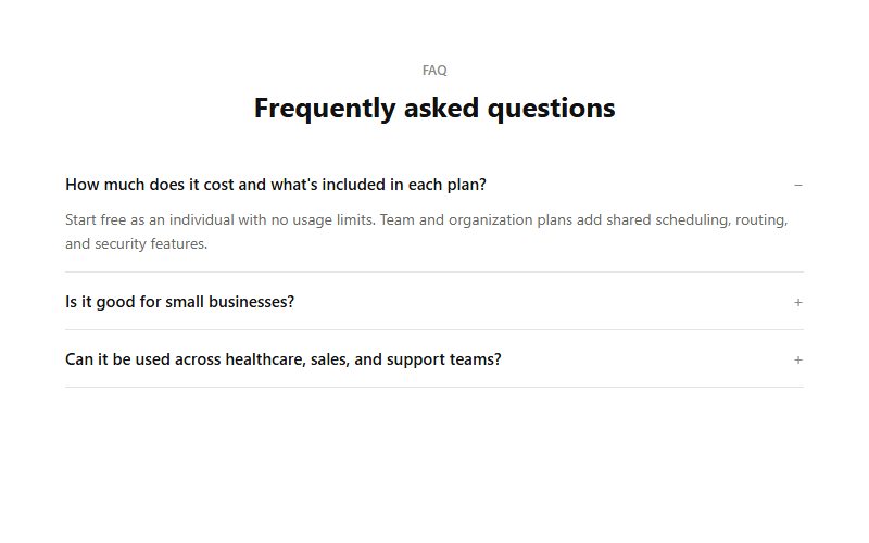
Zero-JS accordion built on native details/summary, so it works even if a page's JS bundle fails to load. Good default FAQ block for any landing page. Keep answers to 2-3 sentences; anything longer belongs on a help center page.
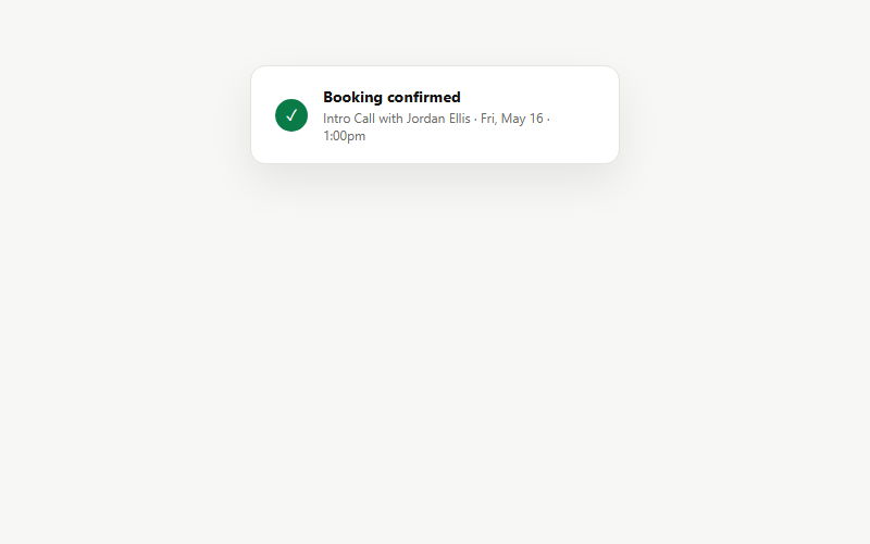
Small floating confirmation toast used inside feature sections or as a standalone success state after a form/booking submits. Keep the copy to one line of detail; this is a glance-and-move-on element, not a receipt.
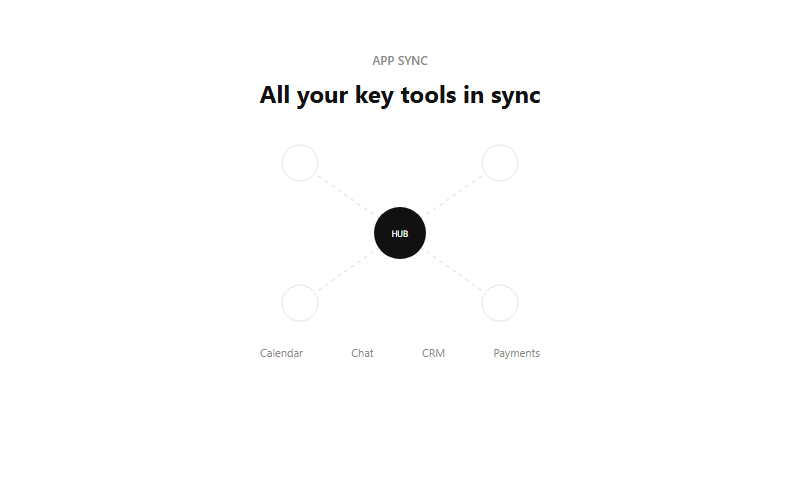
Visual metaphor for 'we connect to everything', a hub node with dashed lines out to satellite app icons. Good directly above or below a logo cloud of actual integration partners. Keep it to 4 satellites max, more than that reads cluttered at small sizes.
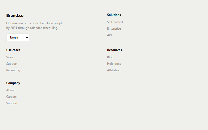
Standard SaaS footer, one brand column plus four link columns and a language selector for international traffic. Drop columns that do not apply rather than leaving them empty; an uneven 3-column footer still looks intentional.
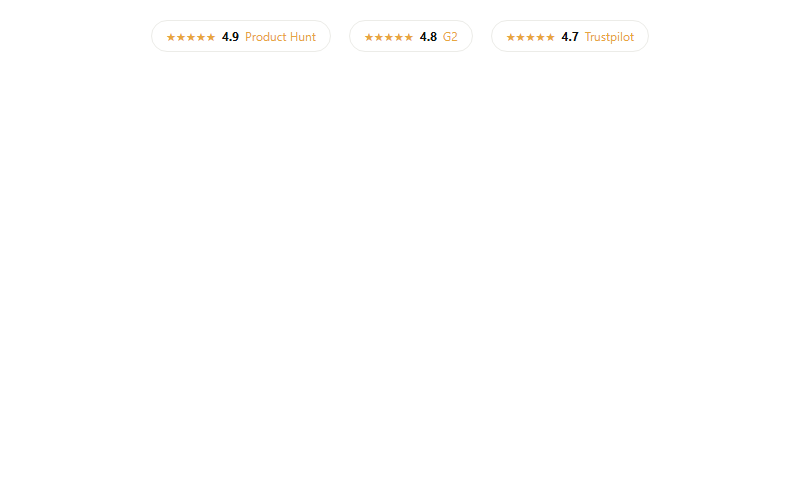
Compact trust row for under a hero or above a final CTA, mixing review-platform ratings. Only use real, current scores, this pattern loses all credibility the moment a visitor checks and finds a mismatch.
Want a site built by the same team that curates Cal.com patterns?
FWON ships full production sites in 3 weeks. No contract, no credit card.