
Linear.app patterns
Layout + interaction patterns we reconstructed from Linear.app.
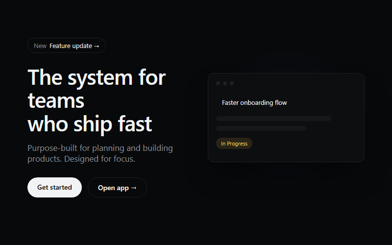
Use for SaaS or product-tool landing pages that need a dark, technical first impression. Skip for warm consumer brands, the near-black ground reads cold.

Load-triggered reveal, each word blurs in on a stagger. Re-trigger on route change by toggling a class rather than replaying automatically, replaying every scroll gets annoying fast.
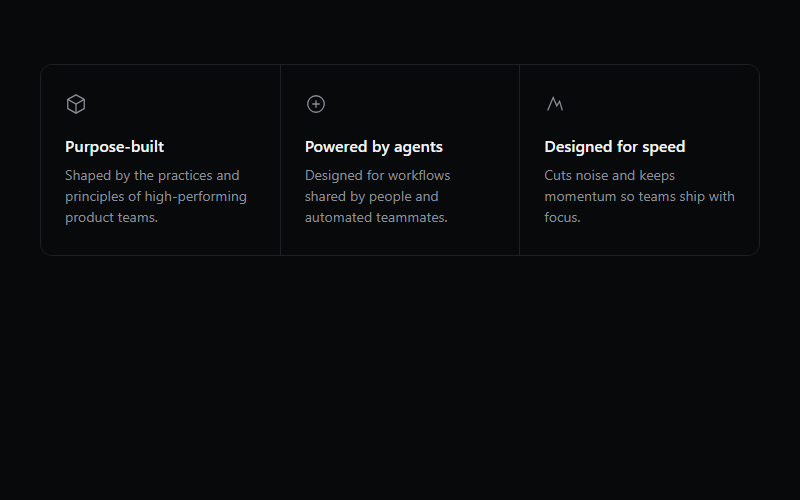
Three-up value prop grid, works for any B2B tool. Swap the inline SVGs for whatever icon set the client already uses, do not leave the placeholder geometric icons in production.

Text stands in for logo marks here, swap spans for real client-approved logo SVGs at consistent height. The mono micro-label under the row is what sells the credibility, keep it short.
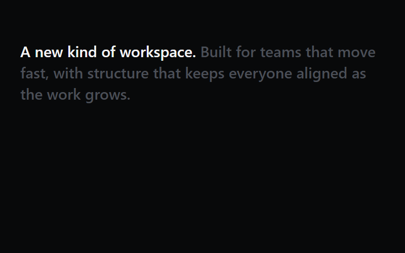
Bold lead clause stays fully opaque, the rest of the sentence dims until the block is half in view. Good for a single mission-style statement between feature sections, not for body copy.
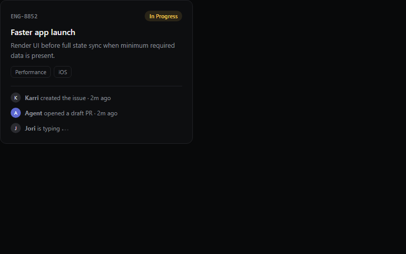
Great for showing product depth on a features page without a real screenshot. The typing-dots row implies a live collaborative tool, drop it if the product has no chat or comments.
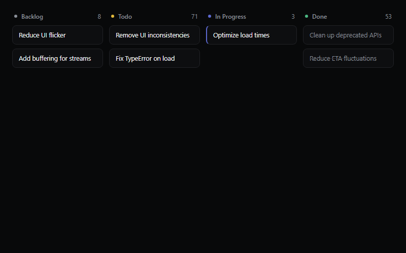
Static kanban illustration for a product/features page, not a real board. Keep to 3-5 items per column so it reads at a glance, more than that looks cluttered at hero scale.
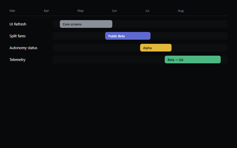
Roadmap/gantt visual for a planning-tool features page. Bar widths are illustrative, wire to real milestone data if this ever leaves marketing and becomes a real product view.
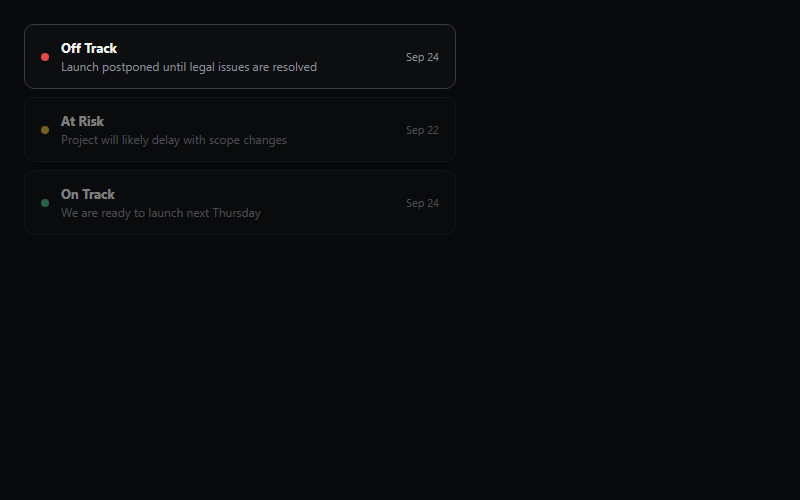
Auto-cycles which status row is highlighted every ~2s to imply a live feed. Cap at 3-4 rows, the highlight cycle gets hard to follow past that.
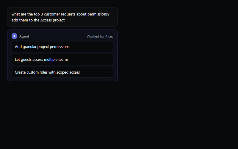
Shows a user prompt, a brief working state, then the agent's structured output. Timing is fixed at 1.4s here, tie it to a real async call if this pattern ships inside an actual product instead of a marketing page.
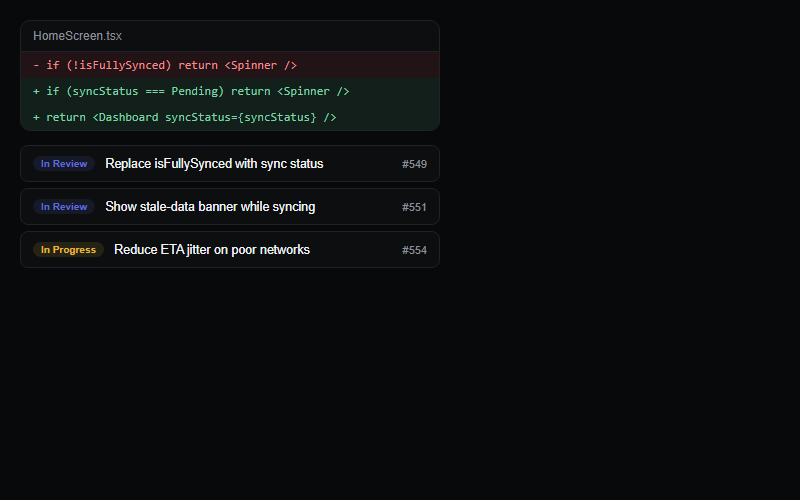
Pairs a code diff with a linked PR list to sell a dev-tool feature. Keep the diff to 2-4 lines, a real full diff breaks the compact card layout.
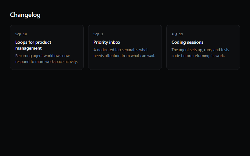
Three-card changelog teaser for a homepage or product page, links out to a full changelog. Hover-lift is the whole interaction, do not add more motion on top of it.
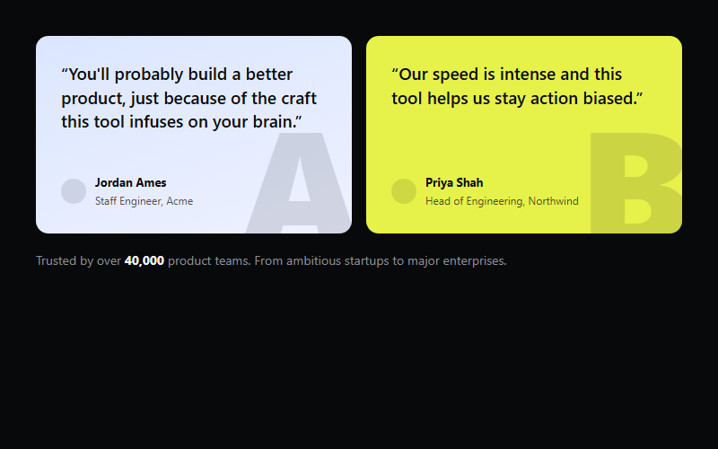
High-contrast colored cards against a near-black page make testimonials pop instead of blending into a gray wall of quotes. Swap the two accent colors per client brand, keep the dark page ground fixed for contrast.
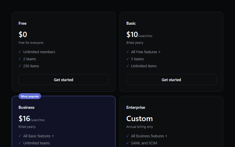
Four-tier table with one highlighted plan, tag placed on the top border like a floating label. Reads best with 3-6 bullets per tier, more and the cards go uneven height.

Closing-section CTA, works right above the footer on any marketing page. Keep it to exactly two actions, a primary and a lower-commitment fallback.
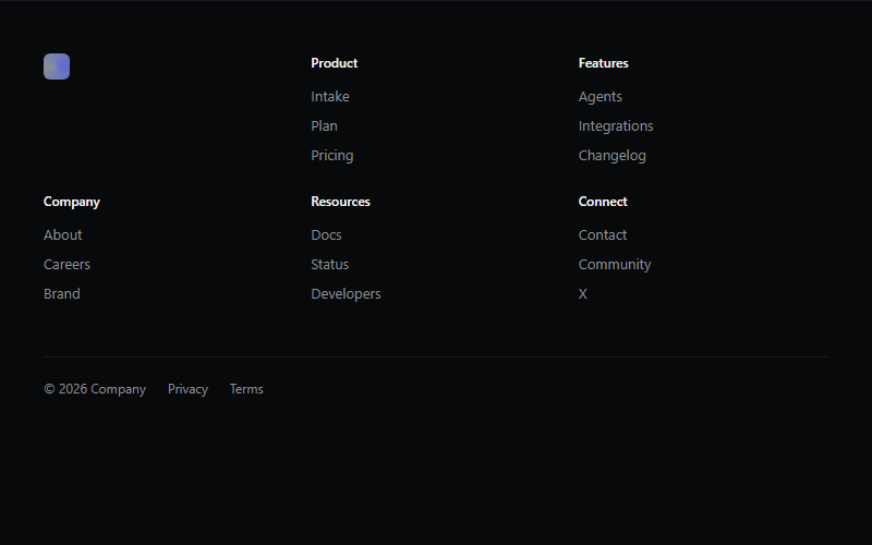
Six-column dark footer, first column is reserved for the logo mark only, keep it uncluttered. Collapses to 3 then 2 columns on smaller widths, test the wrap point against the client's actual link count.
Want a site built by the same team that curates Linear.app patterns?
FWON ships full production sites in 3 weeks. No contract, no credit card.