
Stripe.com patterns
The Stripe playbook rebuilt in vanilla — gradient hero, bento grids, payment forms.

Dark gradient hero with three drifting blurred blobs and a small live-updating ticker chip above the headline, the texture Stripe uses to avoid a flat gradient. Swap the ticker for a real metric or delete it, it is decorative only.
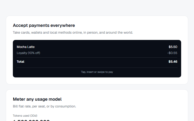
Bento-style grid mixing a wide feature card with a payment-terminal mockup, a usage meter card with an animated fill bar, and a chat-style agentic commerce card. Good for a multi-product overview section, swap the three mockups per client's actual product set.
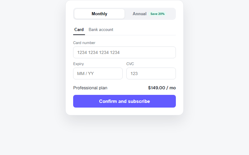
Self-contained checkout card with a monthly/annual pill toggle that updates the displayed price, and a card/bank payment method tab switch. Static mockup only, wire the buttons to a real payment processor before shipping to a client.
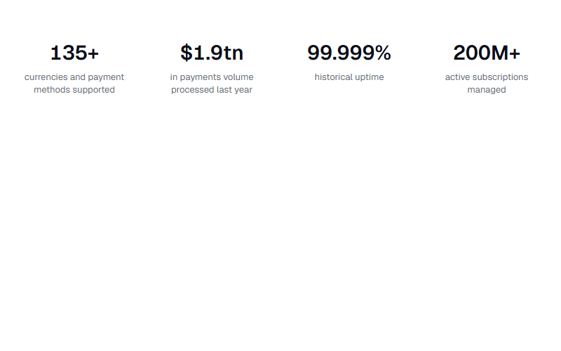
Four-stat row that counts up from zero when it scrolls into view, using IntersectionObserver plus requestAnimationFrame, no animation library needed. Swap the data-target/prefix/suffix attributes per stat, keep to four items or the row gets cramped on mobile.
Pure CSS infinite marquee, duplicate the logo group once so the loop is seamless and pause on hover so a visitor can read a name. Swap the text chips for real logo SVGs/images at matched heights.
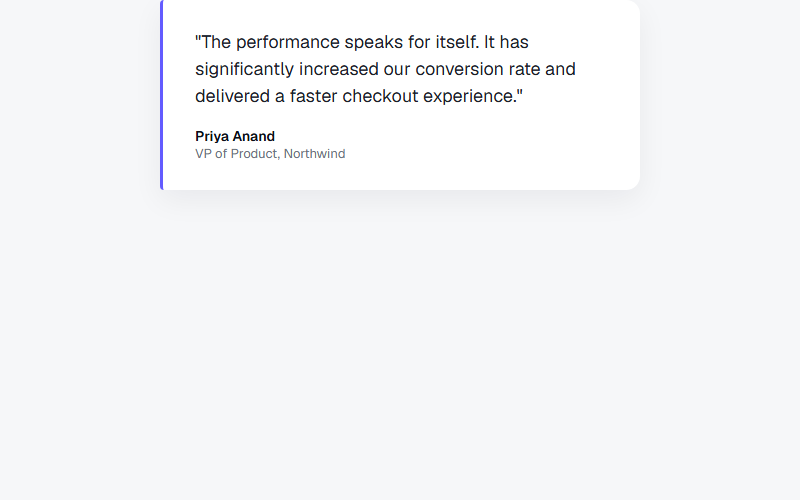
Single pull-quote card with a colored left accent bar rather than a photo, works well in a grid of three when paired with a small logo mark under the name. Never fabricate an attributed quote, only use real customer language on client sites.
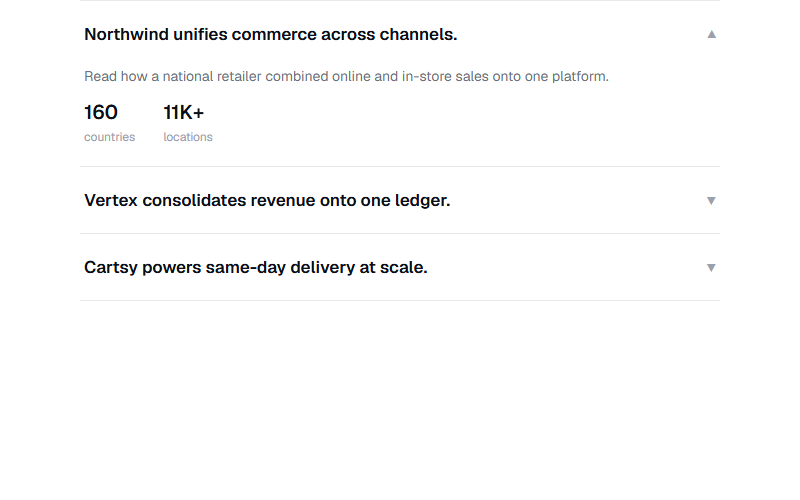
Accordion of case-study rows, only one open at a time, each reveals two stat chips on expand. Good for a customer-proof section without full case study pages. Replace the stat numbers and copy with the client's real, verifiable figures only.
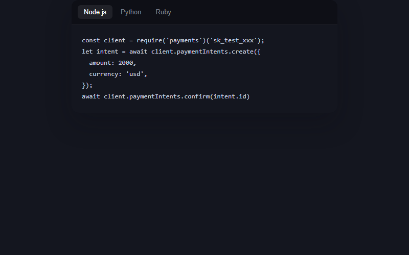
Dark code card with a language tab switcher, the code types itself in on load and on tab change with a blinking caret, no syntax highlighter dependency, just monospace color and a caret pseudo-element. Great for a developer-facing product page, skip it entirely for local-business or non-technical clients.
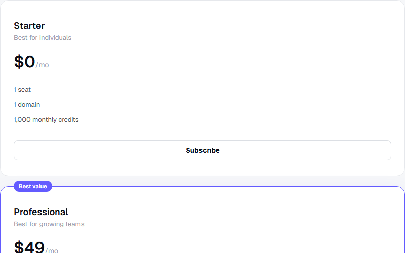
Three pricing cards where the middle plan is visually elevated with a floating badge and a colored border instead of a filled background, reads as recommended without shouting. Keep exactly one featured card, two looks indecisive.
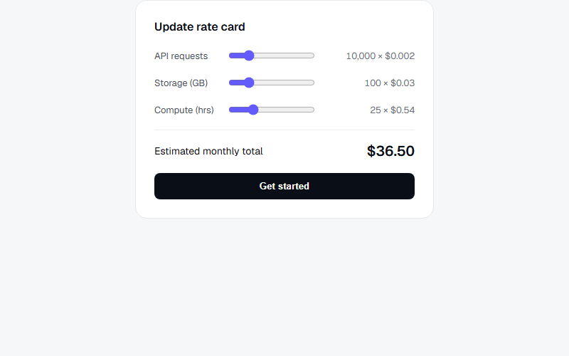
Interactive rate card where dragging each usage slider recalculates the line cost and the monthly total live, mirrors how Stripe visualizes usage-based pricing. Best on a usage-billing or API-product pricing page, overkill for a flat-fee service business.
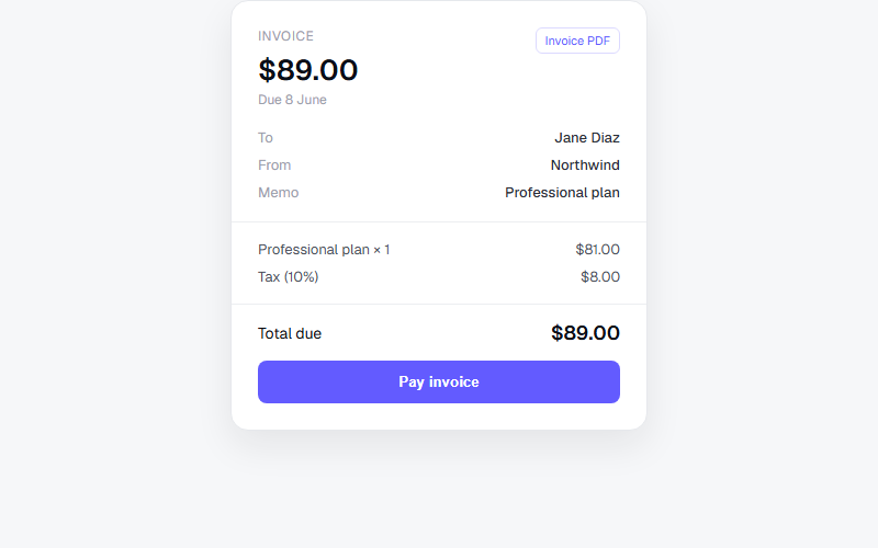
Static invoice card with a to/from/memo block, itemized lines, and a total due, matches the shape of a Stripe-hosted invoice page. Drop into a billing or account-history section, keep the meta rows to three or four max before it feels cluttered.
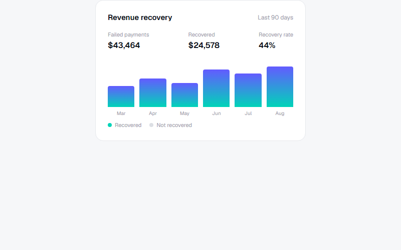
Mini analytics card, bars grow from zero via a CSS custom property once the card scrolls into view, no chart library needed for a simple monthly comparison. Only use this shape when the numbers are real and pulled from the client's own dashboard data.
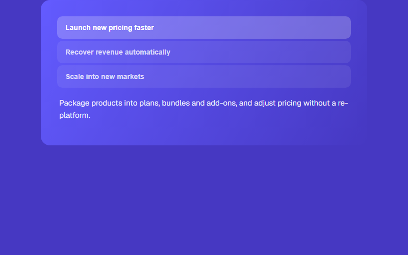
Stacked tab list where clicking an item swaps both the copy panel and the card's background gradient, gives a feature list some motion without a carousel. Limit to three or four tabs, more than that and the background changes feel busy.
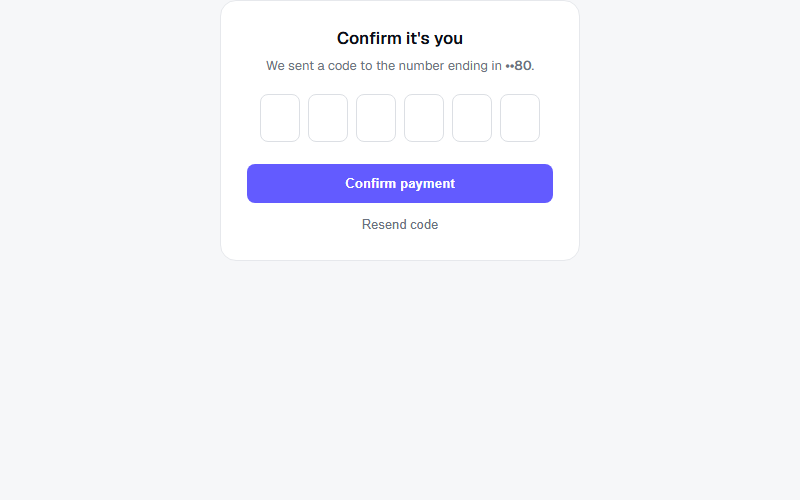
Six-box one-time-code input that auto-advances focus as digits are typed and steps back on backspace. Use for a real 3D Secure or SMS step, not as a fake trust signal, and connect it to an actual verification flow before shipping.
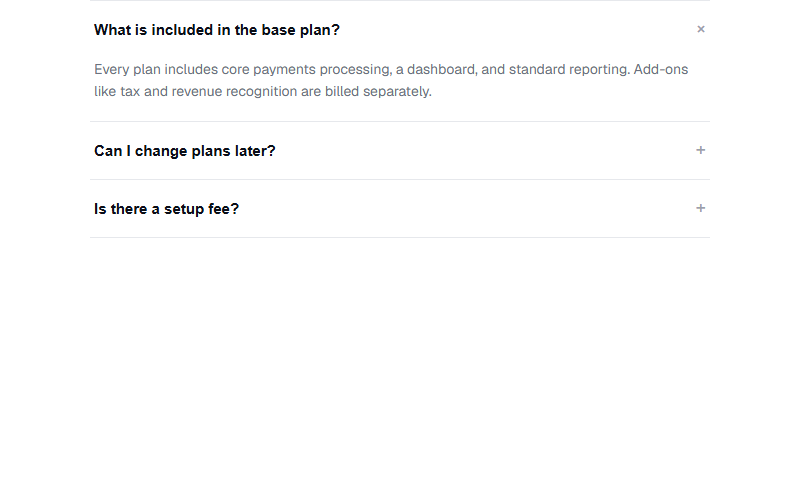
Standard FAQ accordion, plus icon rotates 45 degrees into an X on open, multiple items can stay open at once since each panel is independent. Keep answers to two or three sentences, long answers fight the max-height animation.
Want a site built by the same team that curates Stripe.com patterns?
FWON ships full production sites in 3 weeks. No contract, no credit card.