
FWON — Type in Motion
Text-animation patterns we ship on client sites. Line-mask reveals, kinetic type, split-flap counters, cinematic hero openers.
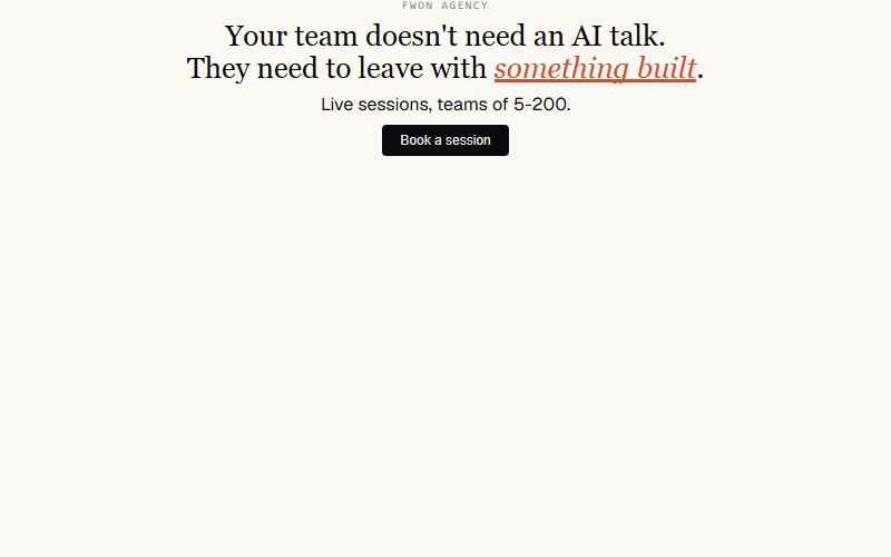
Nav's full opener: eyebrow rises, headline lines lift out of masks, orange sweep lands under the emphasis word, sub fades in, CTA cascades, ring pulses. One choreography, ~2.5s.
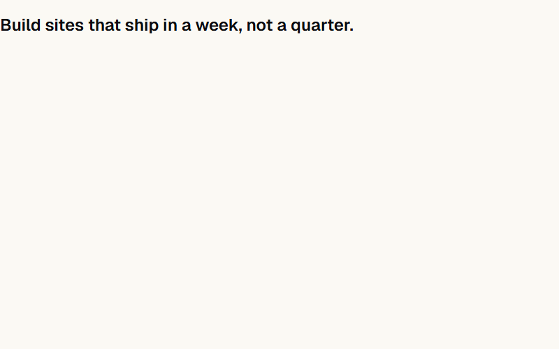
Nav's headline signature, ported without SplitText. Each line sits inside its own overflow-hidden mask; a 15-line vanilla splitter measures wraps at layout time so it survives resize.
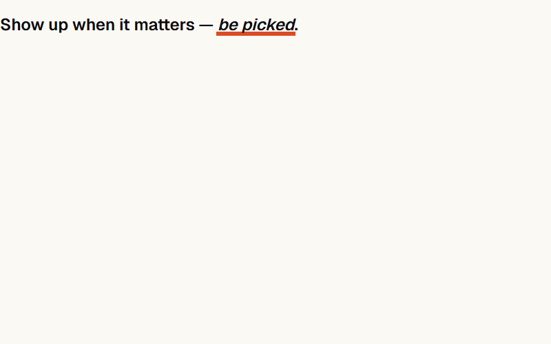
Orange bar sweeps under a keyword to punctuate a headline. Nav uses it under 'THIS IS THE FIX' — a full-stop for the eye.
Draws the eye to the button after the hero settles: soft ring expands and fades, button bumps 4% in size. One breath, then quiet.
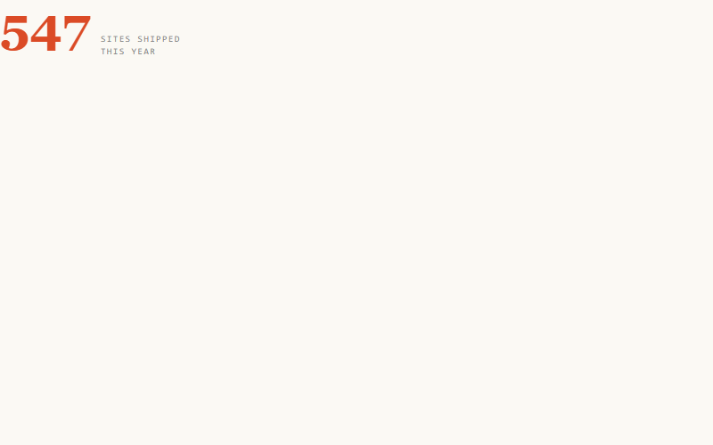
Number eases from 0 to target with ease-out. Nav uses it for revenue and views — the resting state is the final number, so noscript readers see the truth.
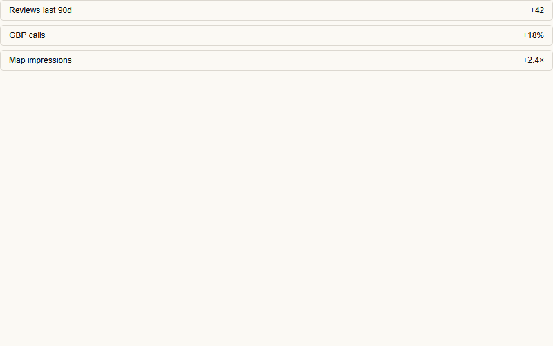
Group of siblings rises together at 60ms offsets. Use it for stat rows, feature grids, list items entering on scroll.
Nav's 'silk-band' — a slow warm blur behind the hero that drifts on scroll. Purely atmospheric. Skip unless the hero is quiet enough to notice.
Each word fades in and lifts 14px, 60ms apart. Softer than line-mask — good for body-copy leads and sub-heads.
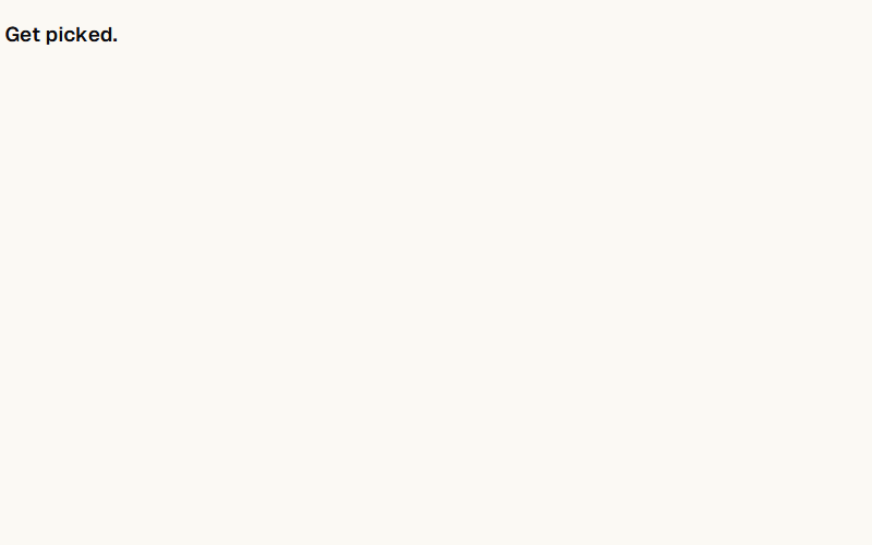
Every letter rises 12px with a tiny rotation, 25ms apart. Reserve for short headings (5-8 words max) — it gets busy fast.
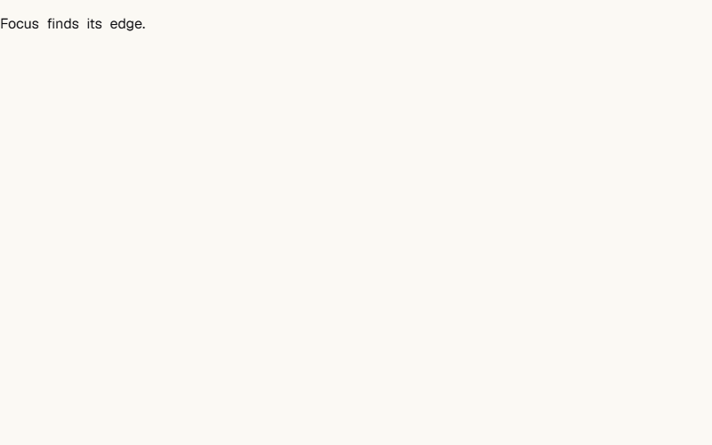
Words come from blur(12px). Feels cinematic without much travel. Cheap on the compositor if you keep the blur below 16px.
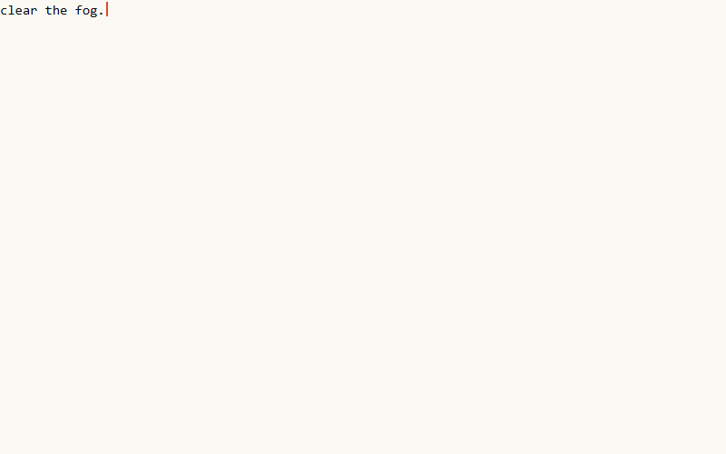
Types out one character per ~50ms with a blinking bar. Slow-feeling — use only when the effect itself IS the moment (product name reveal, hero code sample).
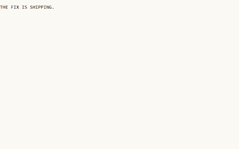
Characters shuffle through random glyphs, then land. Great for numbers, product codes, dashboard headers. Locks left-to-right by default.
Cycles through a word list with a soft opacity crossfade. The softest of the three rotators — use for sub-heads where motion should feel ambient.
Words slide up out of the top of a mask while the next word rises in. Snappier than crossfade — the industry-page trick.
Two-copy trick: duplicate the track content, translate -50%, loop forever. No JS at all, and it survives resize because it moves the track, not the container.
Same trick, but paused when the mouse is over it — lets people actually read the items. One CSS rule, no JS.
Airport-departure-board style. Each digit rolls independently — slower feel than the eased counter, better for showy stats.
Link underline sweeps in from the left on hover. Nav uses this pattern on nav items — one of those details you notice only when it's not there.
A soft translucent bar sweeps behind a phrase, like a yellow marker. Slower and softer than the sweep-highlight bar — good inside body copy.
RGB-split with a stuttering clip. Reserve for one moment — logo reveal, 404 page, a single H1. Any more and it reads as broken.
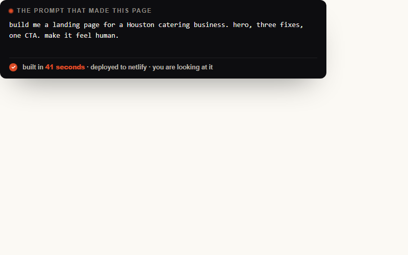
Nav's centerpiece on /yeg. Dark card, ping-dot label, monospace typewriter body, orange tick + result appears after typing settles. Reads as 'this thing was just built' — perfect for FWON's own site or a demo.
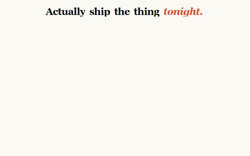
Words rise out of masks with a 40deg X-axis rotation — more cinematic than a flat lift. Nav uses this for the /yeg hero H1. Give it perspective on the parent or the rotation looks flat.
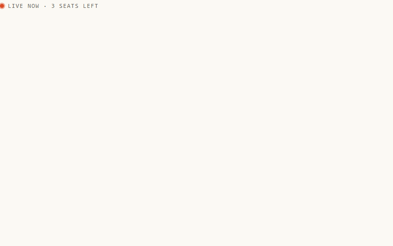
The 'live now / just shipped' dot. One CSS keyframe. Nav uses it on eyebrows and inside the prompt-receipt header. Best paired with a monospace uppercase label — it inherits the pulse the eye reads as 'active.'
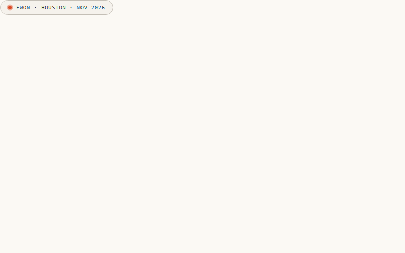
Chip 23 + a pill wrapper. Slot for status labels above the H1 ('Claude 101 · Edmonton · Sept 17') or category tags. Nav's exact eyebrow pattern.
Solid button where a darker fill slides in from the left on hover, and the arrow nudges. Snappier than a plain opacity hover, and it survives on dark backgrounds. Nav's primary CTA.
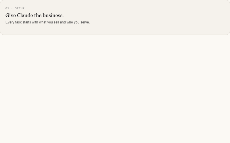
Cards tilt toward the cursor's X/Y and a soft glow follows underneath. Nav uses it on feature cards. Pointer-fine only — pass the media query so touch devices get a flat card.
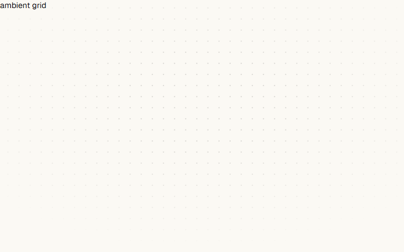
Ambient dot-grid that slowly translates diagonally, softly masked toward the center so it fades at the edges. Nav's hero backdrop. Pure CSS — one background-image + one keyframe.
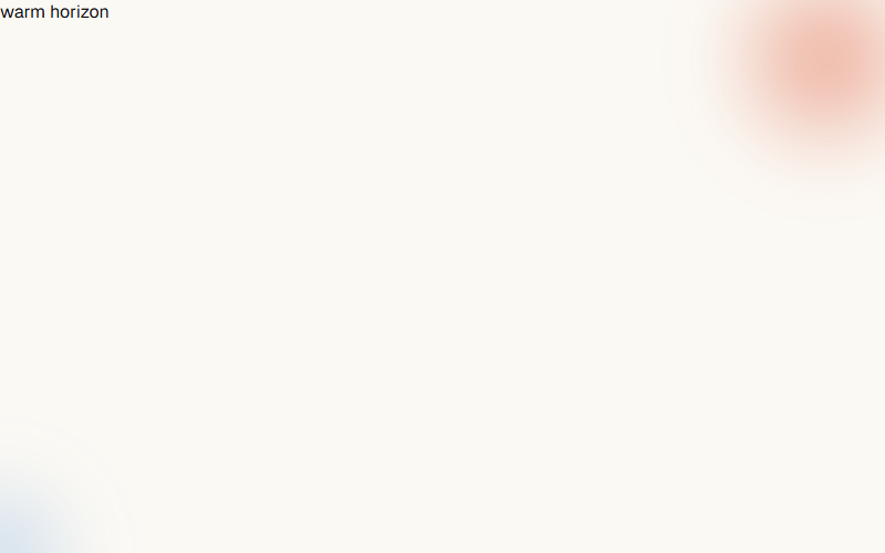
Two big blurred color orbs that drift and scale on ease-in-out. Warm one top-right, cool one bottom-left. Cheap way to add depth behind a quiet hero without hero imagery.
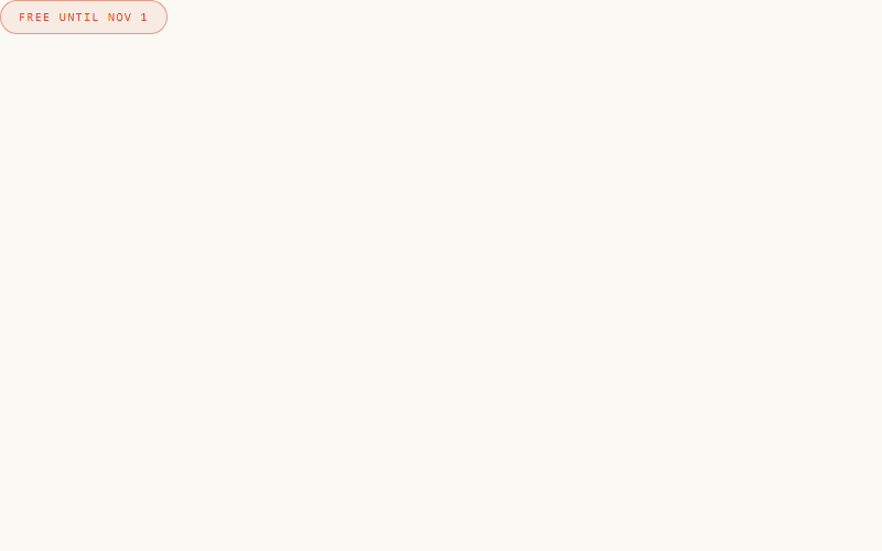
Border color oscillates between two accent tints on a 3s ease-in-out. Perfect for an eyebrow that should catch a scanning eye without motion in position — feels 'alive' without moving.
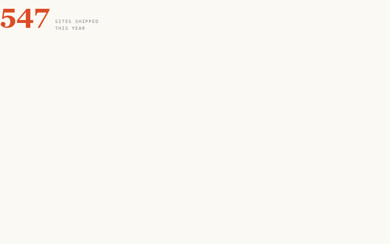
Combines count-up 05 with Nav's `countpulse` — the number scales 6% when it lands, giving the arrival a small pop the eye catches. Reads more 'alive' than eased-only. Use for hero stats and social proof.
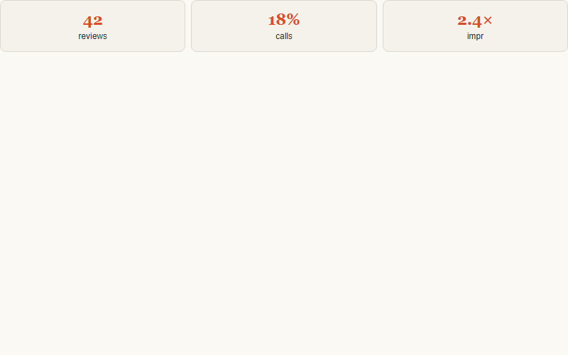
Cards scale from .92 to 1 with a fade — softer than a Y-lift because there's no vertical travel. Nav's default on stat tiles and score cards. Good for image grids where an upward push would shove things around.
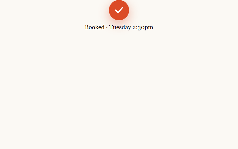
The moment after a form submit or booking. Circle pops from scale .4 to 1, then the tick strokes in via stroke-dashoffset, then the label rises. Three staggered moves, ~1.1s total — the confirmation reads as EARNED, not instant.
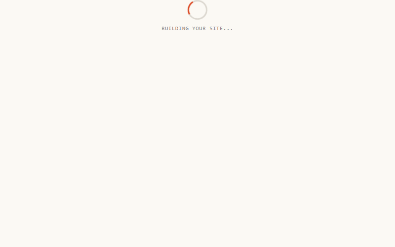
One 3px border, one keyframe, rotates forever. Nav uses it on /audit while their assessment generates. Pair with a copy line ('Building your site…') and it reads as active work, not a page hang.
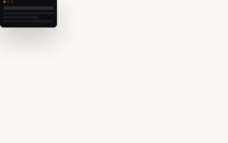
The product-mockup screenshot in the hero right column that gently bobs up and down. `translateY(0 → -10px)` on 7s ease-in-out, both directions. Enough to feel alive, not enough to distract from the copy on the left.
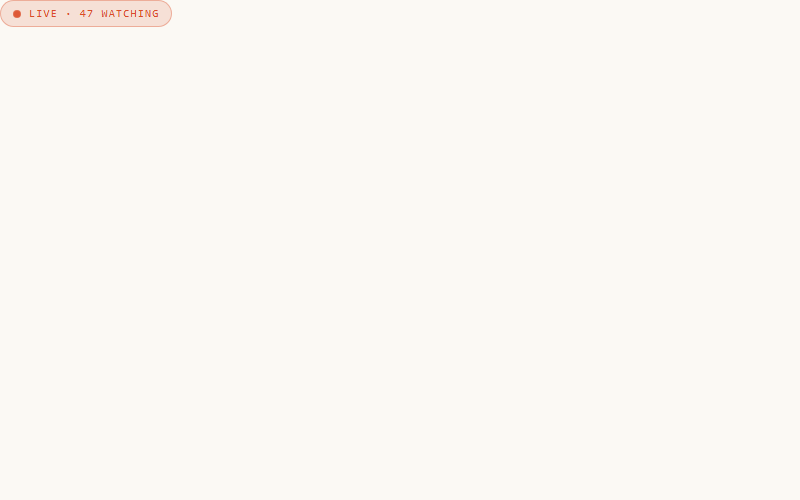
Different from ping (card 23): this pulses opacity + scale together instead of expanding a shadow ring. Softer, slower — 'live now' rather than 'just shipped'. Nav uses it on the /live seat-count chip.
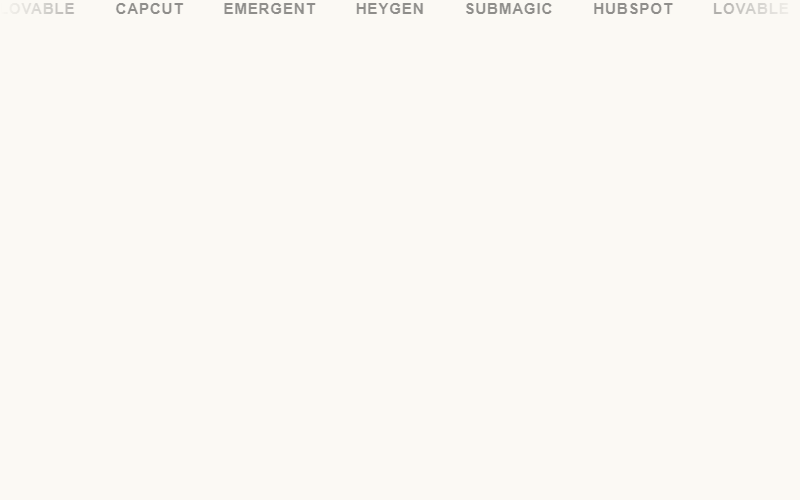
Nav's brand-trust strip: infinite horizontal scroll, edges masked with a linear-gradient so logos fade in/out, individual logos come back to full color on hover, whole track pauses on hover. Swap the text nodes for `<img>` tags in real use.
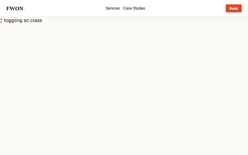
Nav bar tightens up and gains a soft shadow once the page has scrolled past ~40px. Nav toggles a `.sc` class via a scroll listener. Preview loops the state every 2s so you see both. Real usage: throttle the scroll handler or use IntersectionObserver on a hero sentinel.
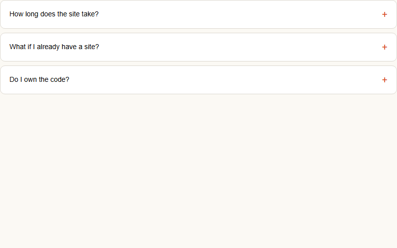
Nav's /faq pattern: click the row, plus icon rotates 45deg (becomes X), answer transitions its max-height open. One-at-a-time (radio-style) — opening one closes any other. max-height is the pragmatic trick: `height: auto` can't transition.
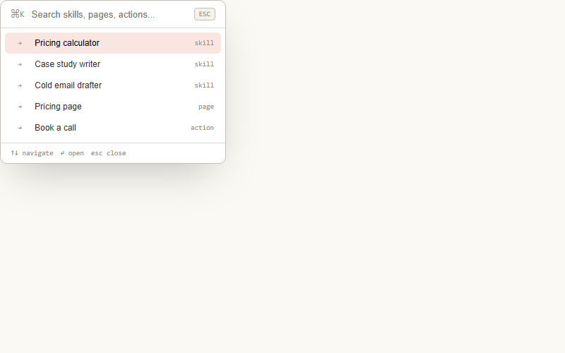
Ships-with-modern-site UX: ⌘K opens a search-first launcher, type to filter results, arrow keys to navigate, enter to jump. Use for skill libraries, product catalogs, docs. Preview auto-types a query so you see the filter kick in.
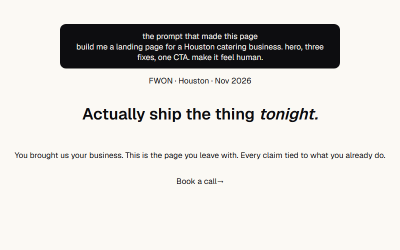
Nav's /yeg opener composed: prompt receipt card up top, ping chip, word flip-in H1 with italic accent word, sub, fill-slide CTA. Sequence: card at 0s, chip .3s, H1 words .5–.85s, sub 1.1s, CTA 1.3s. Scale the type up 40% for real hero use.
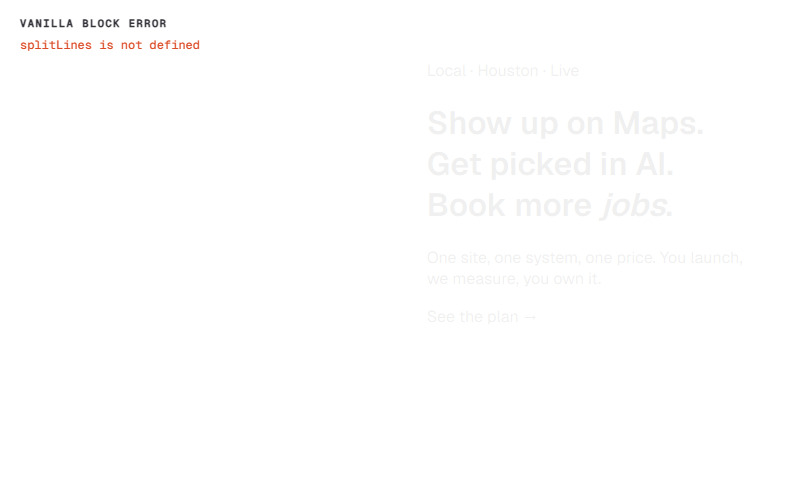
Two-column with orb-blob background: eyebrow chip + line-mask H1 with sweep highlight + sub + CTA on the left, floating dark-mode mockup on the right. Right column hides on narrow — mockup is decoration, copy is the message.
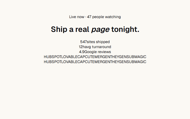
Centered layout: drifting dot-grid background, breathing chip, word-rise H1 with italic accent, stat row, logo cloud at the bottom. Reads as 'social proof at every scale.' Skip the mockup right column, let the type + logos carry it.
Mobile conversion staple: primary CTA is IN the hero, then a sticky bar slides in from the bottom once the hero exits. Nav toggles it via IntersectionObserver on the hero. In the preview it slides in after a delay to show the arrival.
Want a site built by the same team that curates FWON — Type in Motion?
FWON ships full production sites in 3 weeks. No contract, no credit card.