
Vercel.com patterns
Vercel-style shipping — nav-scroll-shrink, radial-glow hero, code callouts.
Nav starts transparent over the hero and gains a white background plus a hairline shadow past a scroll threshold. Swap the spacer block for real page content; keep the threshold under 60px so the transition reads instantly.
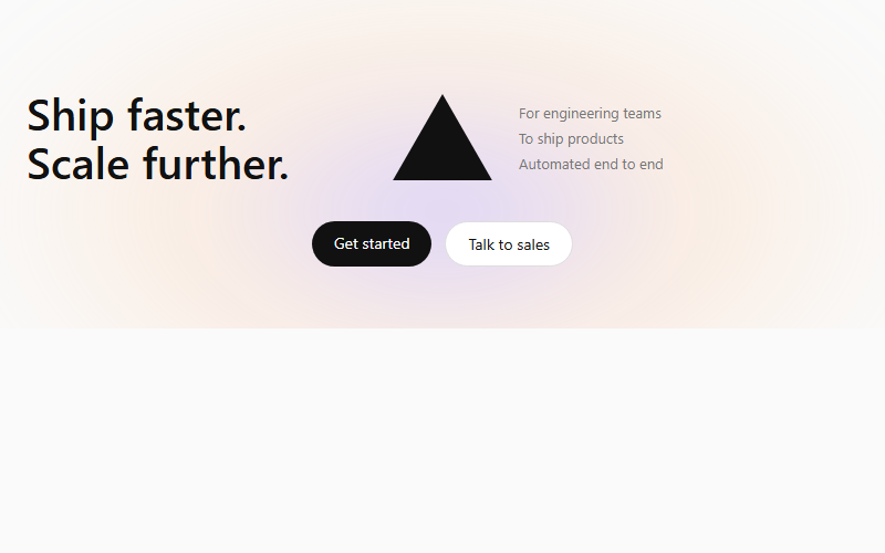
Soft multi-color radial glow blurred behind a centered geometric mark, flanked by a left headline and a right feature list. Works for any dev-tool or infrastructure product; drop the mark for a plainer B2B SaaS hero.
Dimmed, grayscale wordmarks that sharpen to full opacity on hover. Use real client logos as SVGs rather than text once available; keep it to 5-7 marks so the row does not wrap awkwardly.
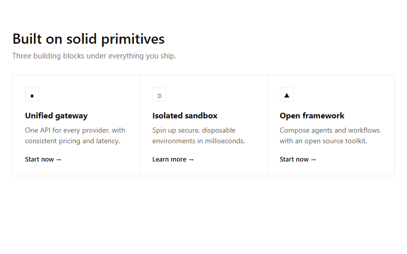
Hairline-divided 3-up grid, each cell an icon chip, short heading, one sentence, and a text link. Reads as technical/infrastructure; swap the icon glyphs for real SVGs before shipping.
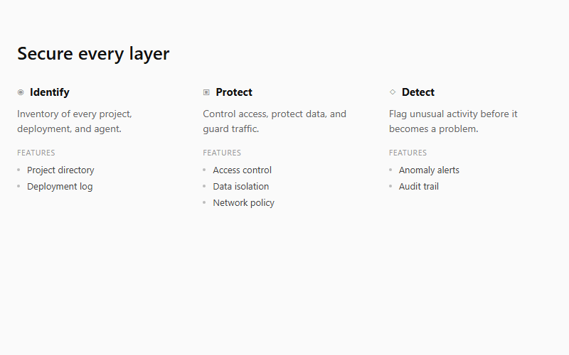
Compact columns pairing a one-line capability summary with an uppercase 'Features' micro-label and a bare-bullet list underneath. Good for security or platform-capability sections; needs 3-5 columns to read as a system, not a list.
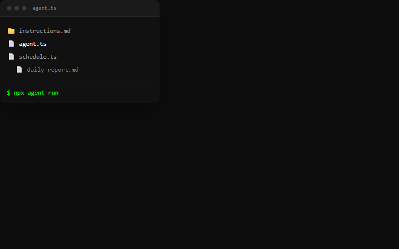
Dark editor-style card: window chrome dots, a mock file tree, and a terminal line that types a command on a loop with a blinking block caret. Good as a floating visual next to feature copy; keep the file list to 3-4 rows so it stays legible at card size.

Full-bleed near-black band pairing a headline with a solid button and a terminal-style install-command chip. Use as a mid-page break between light sections; the chip reinforces a dev-tool product without needing a screenshot.
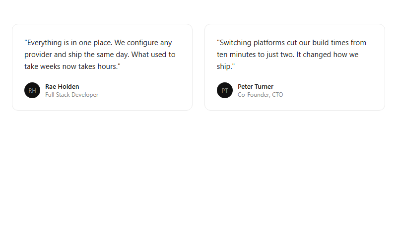
Plain bordered quote cards with an initials avatar, name, and role. Keep quotes under two sentences and specific to a metric or outcome, generic praise reads as filler.
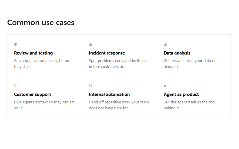
Borderless-feeling grid made from shared hairlines rather than boxed cards, six small use-case cells. Scales to any even number of cells; drop to a 2-column layout under 720px.
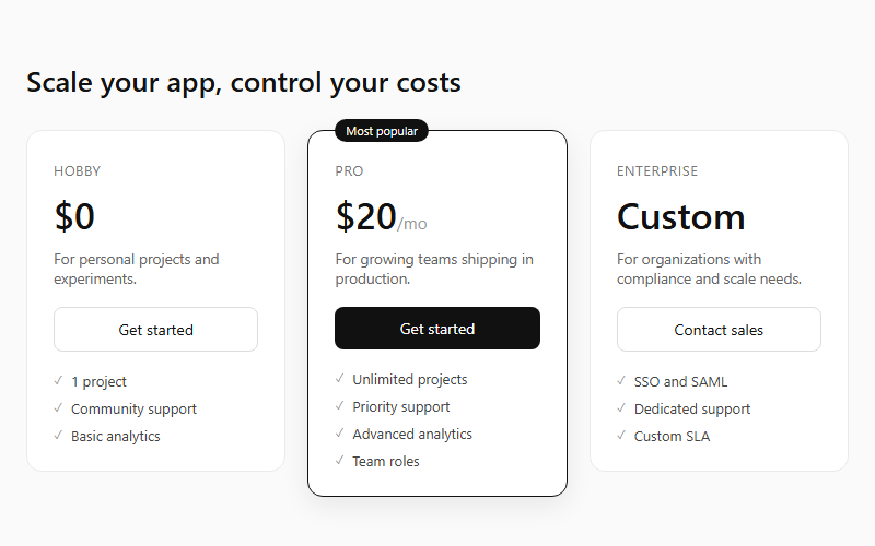
Three flat pricing cards with the middle tier raised by a border, shadow, and a floating 'Most popular' tag. Keep feature lists to 3-5 lines per tier so the cards stay the same visual weight.
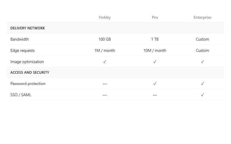
Long-form feature comparison table grouped by category rows, with checkmark or dash cells per plan. Pair with the pricing-tier cards above the fold; this table is for the buyer who scrolls to verify a specific line item.

A small mocked product screenshot (chat bubble, notification, or status row) sits inside a card above the real heading and description. Use this to make an abstract feature feel concrete without a real screenshot; swap the mock content per feature.
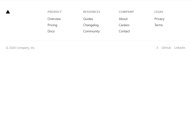
Standard five-column footer, mark plus four link groups, with a bottom bar for copyright and social links. Collapses to two columns under 720px; keep each group to 3-4 links max.
A faint pixel grid faded out via a radial mask so it reads at the edges but disappears behind the centered content. Drop this behind any hero or section divider; adjust background-size to change grid density.
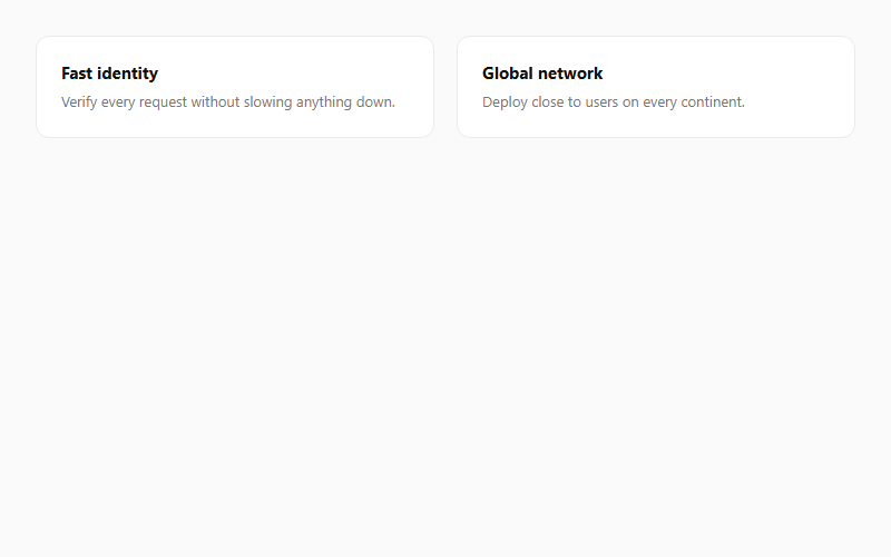
A blurred two-tone gradient sits offscreen inside each card and fades in on hover using mix-blend-mode. Subtle at low opacity; push past .5 and it starts looking like a colored highlight instead of a glow.
Want a site built by the same team that curates Vercel.com patterns?
FWON ships full production sites in 3 weeks. No contract, no credit card.