
Card components
Content cards with hover effects, borders, spotlights, and 3D tilts.
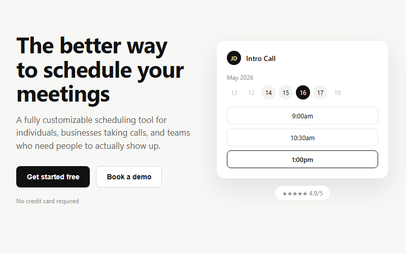
Lead-generation hero for booking or scheduling products: headline plus dual CTA on the left, a live-feeling app mockup on the right. Swap the mockup content for whatever the product actually does; keep the two-button pattern (primary action plus a lower-commitment demo/tour link).
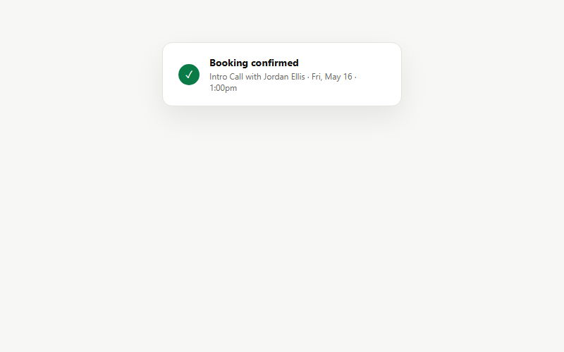
Small floating confirmation toast used inside feature sections or as a standalone success state after a form/booking submits. Keep the copy to one line of detail; this is a glance-and-move-on element, not a receipt.
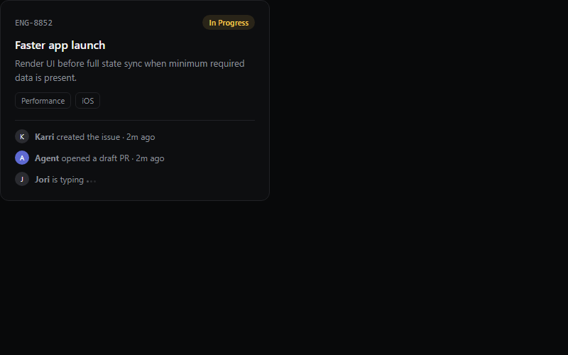
Great for showing product depth on a features page without a real screenshot. The typing-dots row implies a live collaborative tool, drop it if the product has no chat or comments.
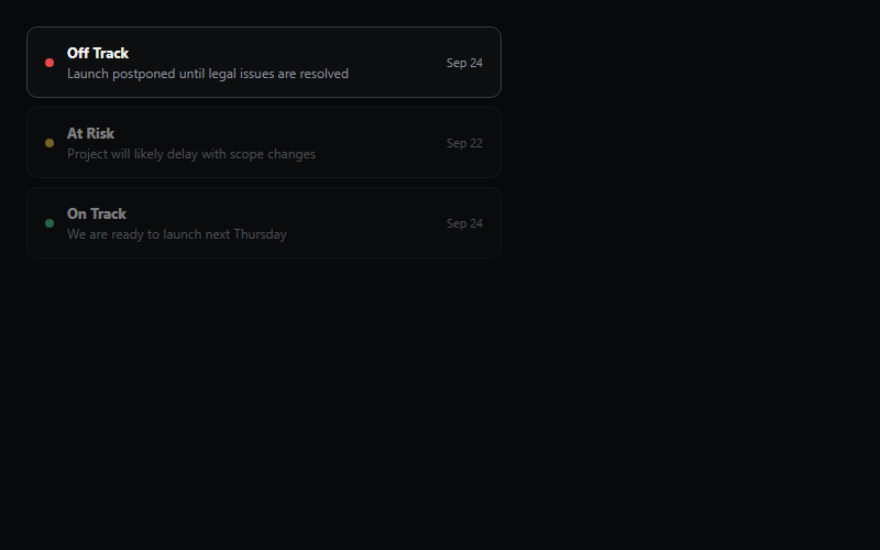
Auto-cycles which status row is highlighted every ~2s to imply a live feed. Cap at 3-4 rows, the highlight cycle gets hard to follow past that.
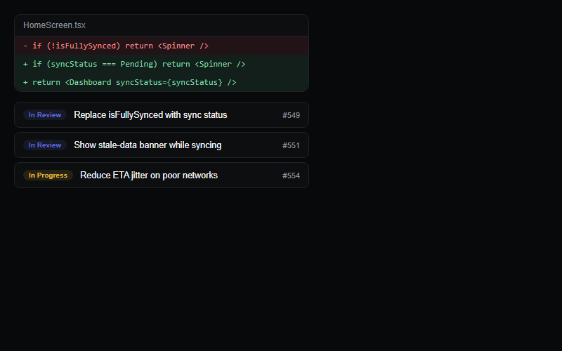
Pairs a code diff with a linked PR list to sell a dev-tool feature. Keep the diff to 2-4 lines, a real full diff breaks the compact card layout.
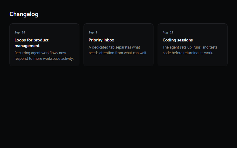
Three-card changelog teaser for a homepage or product page, links out to a full changelog. Hover-lift is the whole interaction, do not add more motion on top of it.
Tracks the cursor and paints a soft radial spotlight plus a highlighted border on hover, wraps around any shadcn/ui Card content. Needs next-themes for the dark/light gradient color swap, strip that if the project has no theme provider.
A single light beam that continuously travels around a container's border, drop it inside any card or button wrapper with `position: relative` and `overflow: hidden`. Cheap way to signal 'this is the highlighted plan' on a pricing card.
Base container for stat blocks, list rows, and form wrappers across the library. Compose with CardHeader, CardContent, and CardFooter instead of overriding the base padding by hand.
Full dashboard shell: collapsible icon sidebar, team switcher, nested nav sections, and a user menu in the footer. Ships as five files (app-sidebar, nav-main, nav-projects, nav-user, team-switcher) plus the base sidebar primitive, pull all of them from the source URL, not just this one.
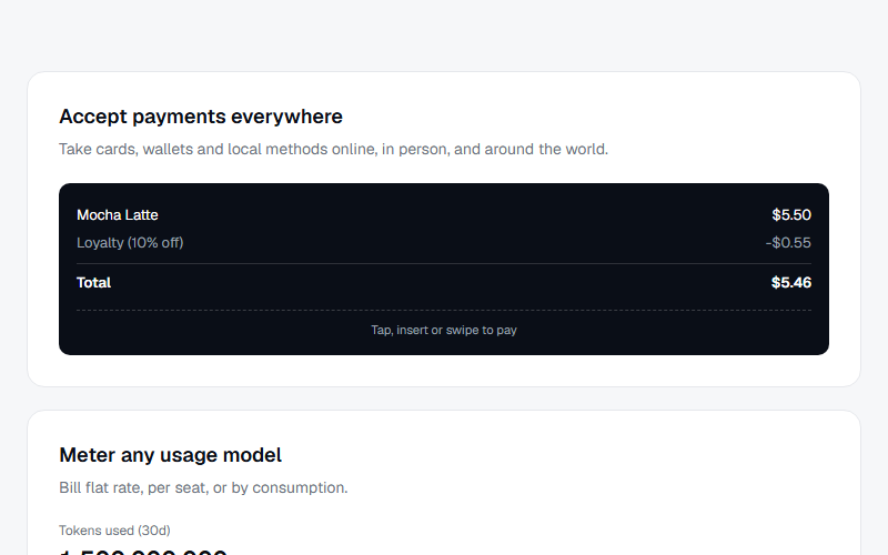
Bento-style grid mixing a wide feature card with a payment-terminal mockup, a usage meter card with an animated fill bar, and a chat-style agentic commerce card. Good for a multi-product overview section, swap the three mockups per client's actual product set.
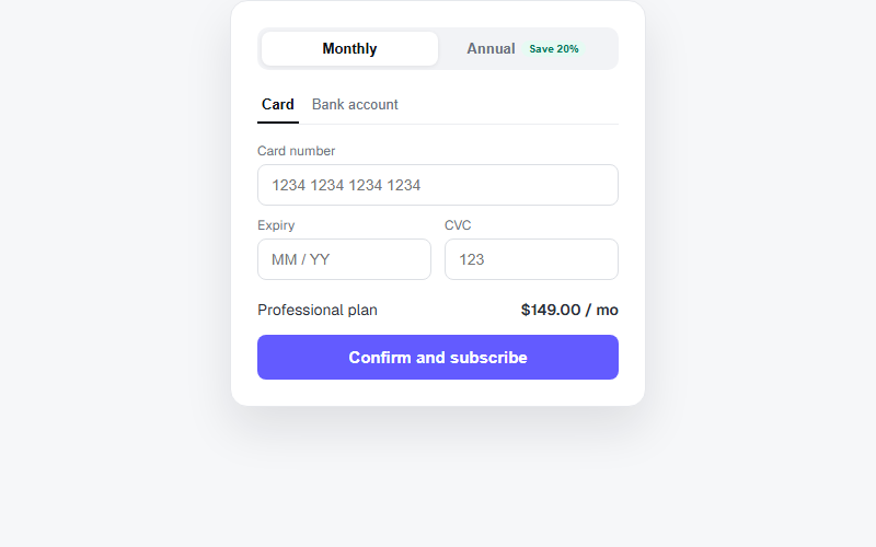
Self-contained checkout card with a monthly/annual pill toggle that updates the displayed price, and a card/bank payment method tab switch. Static mockup only, wire the buttons to a real payment processor before shipping to a client.
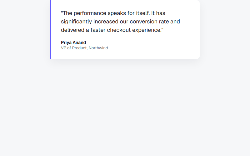
Single pull-quote card with a colored left accent bar rather than a photo, works well in a grid of three when paired with a small logo mark under the name. Never fabricate an attributed quote, only use real customer language on client sites.
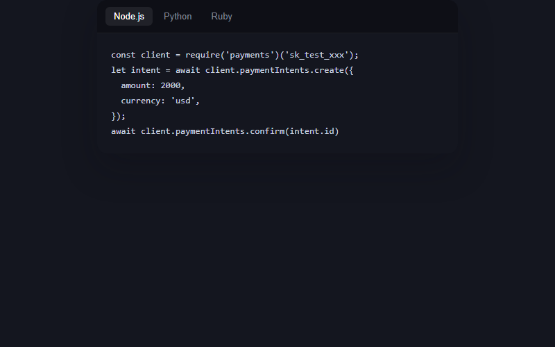
Dark code card with a language tab switcher, the code types itself in on load and on tab change with a blinking caret, no syntax highlighter dependency, just monospace color and a caret pseudo-element. Great for a developer-facing product page, skip it entirely for local-business or non-technical clients.
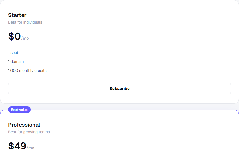
Three pricing cards where the middle plan is visually elevated with a floating badge and a colored border instead of a filled background, reads as recommended without shouting. Keep exactly one featured card, two looks indecisive.
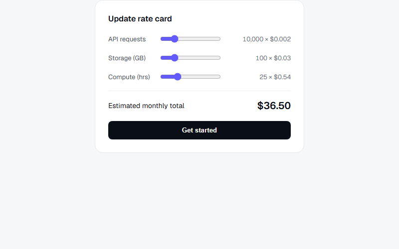
Interactive rate card where dragging each usage slider recalculates the line cost and the monthly total live, mirrors how Stripe visualizes usage-based pricing. Best on a usage-billing or API-product pricing page, overkill for a flat-fee service business.
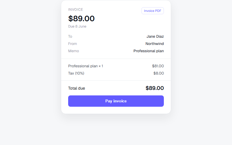
Static invoice card with a to/from/memo block, itemized lines, and a total due, matches the shape of a Stripe-hosted invoice page. Drop into a billing or account-history section, keep the meta rows to three or four max before it feels cluttered.
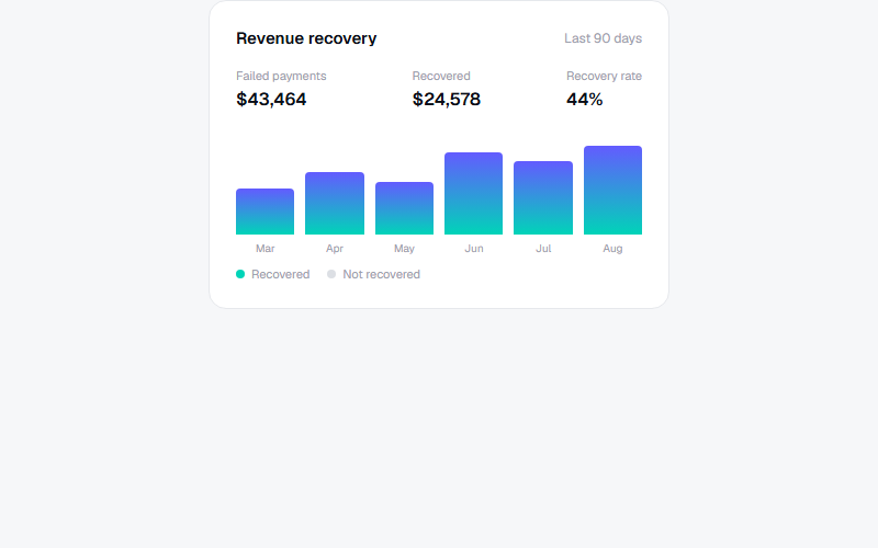
Mini analytics card, bars grow from zero via a CSS custom property once the card scrolls into view, no chart library needed for a simple monthly comparison. Only use this shape when the numbers are real and pulled from the client's own dashboard data.
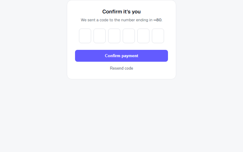
Six-box one-time-code input that auto-advances focus as digits are typed and steps back on backspace. Use for a real 3D Secure or SMS step, not as a fake trust signal, and connect it to an actual verification flow before shipping.
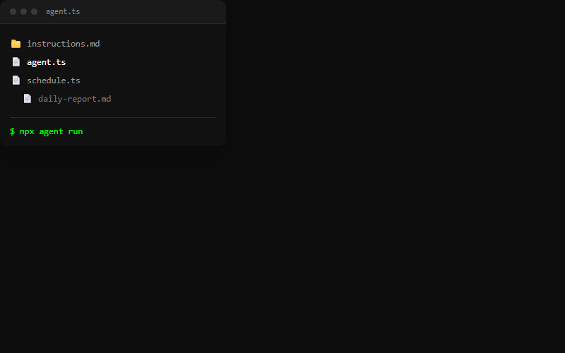
Dark editor-style card: window chrome dots, a mock file tree, and a terminal line that types a command on a loop with a blinking block caret. Good as a floating visual next to feature copy; keep the file list to 3-4 rows so it stays legible at card size.

A small mocked product screenshot (chat bubble, notification, or status row) sits inside a card above the real heading and description. Use this to make an abstract feature feel concrete without a real screenshot; swap the mock content per feature.
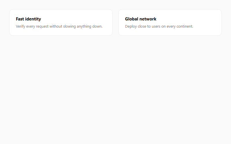
A blurred two-tone gradient sits offscreen inside each card and fades in on hover using mix-blend-mode. Subtle at low opacity; push past .5 and it starts looking like a colored highlight instead of a glow.
Want your site’s card components to look this good?
We build full sites with blocks like these.