
Card Container
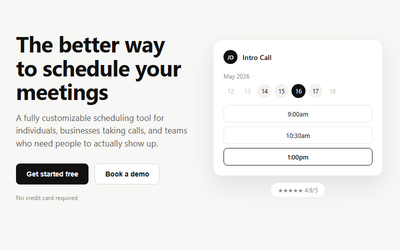
Base container for stat blocks, list rows, and form wrappers across the library. Compose with CardHeader, CardContent, and CardFooter instead of overriding the base padding by hand.
Live preview
open in new tab ↗import * as React from "react"
import { cn } from "@/lib/utils"
function Card({ className, ...props }) {
return (
<div
data-slot="card"
className={cn(
"flex flex-col gap-6 rounded-xl border bg-card py-6 text-card-foreground shadow-sm",
className
)}
{...props}
/>
)
}
function CardHeader({ className, ...props }) {
return (
<div
data-slot="card-header"
className={cn("grid auto-rows-min grid-rows-[auto_auto] items-start gap-2 px-6", className)}
{...props}
/>
)
}
function CardTitle({ className, ...props }) {
return <div data-slot="card-title" className={cn("leading-none font-semibold", className)} {...props} />
}
function CardDescription({ className, ...props }) {
return <div data-slot="card-description" className={cn("text-sm text-muted-foreground", className)} {...props} />
}
function CardContent({ className, ...props }) {
return <div data-slot="card-content" className={cn("px-6", className)} {...props} />
}
function CardFooter({ className, ...props }) {
return <div data-slot="card-footer" className={cn("flex items-center px-6 [.border-t]:pt-6", className)} {...props} />
}
export { Card, CardHeader, CardFooter, CardTitle, CardDescription, CardContent }Block id: shadcn-cardreact-tailwind · drop-in
More card blocks
Want the whole site, not just the block?
We ship real client sites in 3 weeks — with blocks like this one, wired to your brand.