
Feature grids
Ways to lay out three-to-nine features on one screen without it reading as a wall.
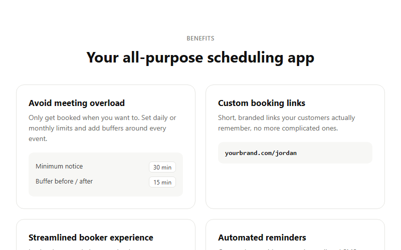
Feature grid where each card carries a tiny illustrative UI snippet instead of a plain icon, makes abstract features feel concrete. Best for product marketing where you have 4 clear, distinct capabilities to show. Swap each mini-mockup for something true to your own UI.
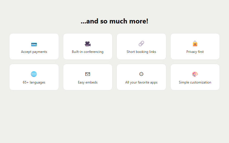
Catch-all grid for secondary features that do not deserve full cards, e.g. security, languages, integrations, small differentiators. Drop this after the main feature grid so the page does not feel like it stopped selling too early.
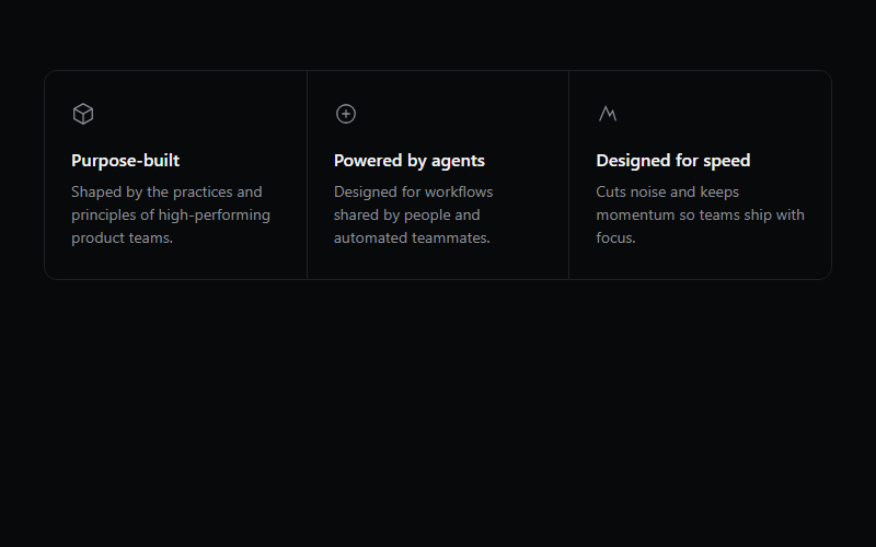
Three-up value prop grid, works for any B2B tool. Swap the inline SVGs for whatever icon set the client already uses, do not leave the placeholder geometric icons in production.
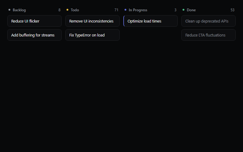
Static kanban illustration for a product/features page, not a real board. Keep to 3-5 items per column so it reads at a glance, more than that looks cluttered at hero scale.
Uneven-sized CSS grid of feature tiles, each tile can hold its own background visual or animation. Standard 'why us' section layout, three to six tiles reads best, more than that gets cramped on mobile.
Full dashboard shell: collapsible icon sidebar, team switcher, nested nav sections, and a user menu in the footer. Ships as five files (app-sidebar, nav-main, nav-projects, nav-user, team-switcher) plus the base sidebar primitive, pull all of them from the source URL, not just this one.
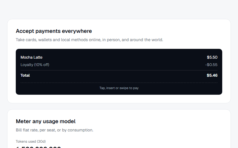
Bento-style grid mixing a wide feature card with a payment-terminal mockup, a usage meter card with an animated fill bar, and a chat-style agentic commerce card. Good for a multi-product overview section, swap the three mockups per client's actual product set.
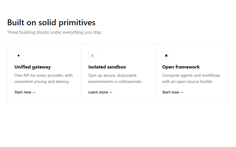
Hairline-divided 3-up grid, each cell an icon chip, short heading, one sentence, and a text link. Reads as technical/infrastructure; swap the icon glyphs for real SVGs before shipping.
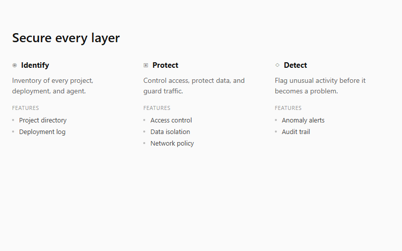
Compact columns pairing a one-line capability summary with an uppercase 'Features' micro-label and a bare-bullet list underneath. Good for security or platform-capability sections; needs 3-5 columns to read as a system, not a list.
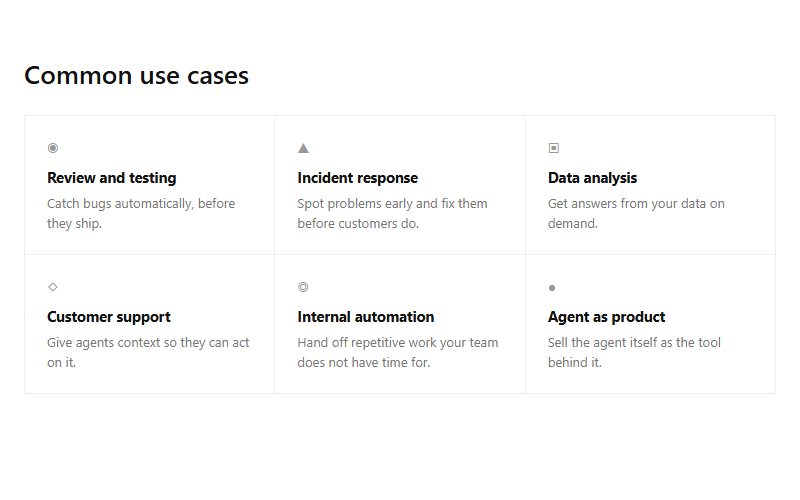
Borderless-feeling grid made from shared hairlines rather than boxed cards, six small use-case cells. Scales to any even number of cells; drop to a 2-column layout under 720px.
Want your site’s feature grids to look this good?
We build full sites with blocks like these.