
Bento-style feature grid
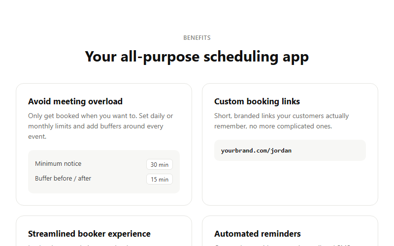
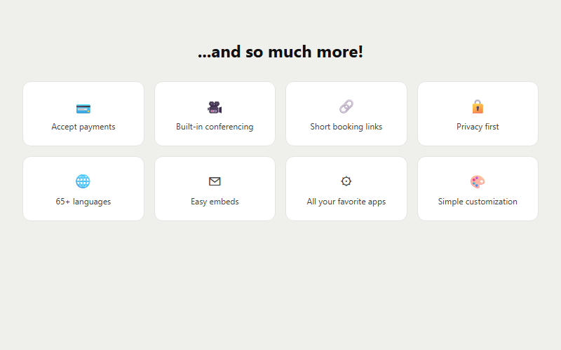
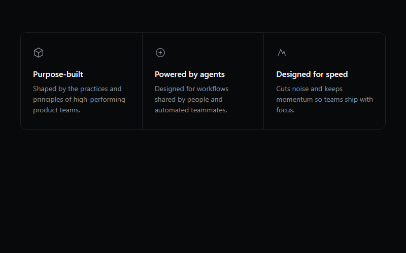
Uneven-sized CSS grid of feature tiles, each tile can hold its own background visual or animation. Standard 'why us' section layout, three to six tiles reads best, more than that gets cramped on mobile.
Live preview
open in new tab ↗import { BentoCard, BentoGrid } from "@/components/magicui/bento-grid"
const features = [
{ name: "Save your files", description: "Files sync automatically as you work.", className: "col-span-3 lg:col-span-1" },
{ name: "Notifications", description: "Get notified the moment something happens.", className: "col-span-3 lg:col-span-2" },
{ name: "Integrations", description: "Connects with the tools your team already uses.", className: "col-span-3 lg:col-span-1" },
]
export function BentoDemo() {
return (
<BentoGrid>
{features.map((feature) => (
<BentoCard key={feature.name} {...feature} />
))}
</BentoGrid>
)
}Block id: magicui-bento-gridreact-tailwind · code-required
More feature-grid blocks
Want the whole site, not just the block?
We ship real client sites in 3 weeks — with blocks like this one, wired to your brand.