
MagicUI
Framer Motion animations rebuilt as drop-in React blocks.
Click-to-play video hero, thumbnail scales into a modal player on click. Good for a SaaS or product-demo hero above the fold. Needs an embeddable video URL (YouTube embed format), swap the thumbnail image per client.

80s-style perspective grid, pure CSS animation, no JS cost. Works well behind a bold gradient headline for a synthwave or gaming-adjacent brand. Skip for conservative/professional-services clients, reads too loud.
SVG dot grid with a radial fade mask, subtle enough to sit behind body copy or a pricing table. The glow prop adds a mouse-follow highlight if you want more motion. Safe default background for any vertical.

Diagonal streaking-light overlay, layer it over a dark hero or a 404/empty-state screen. The number prop controls density, keep it under 20 on mobile or it tanks paint performance.
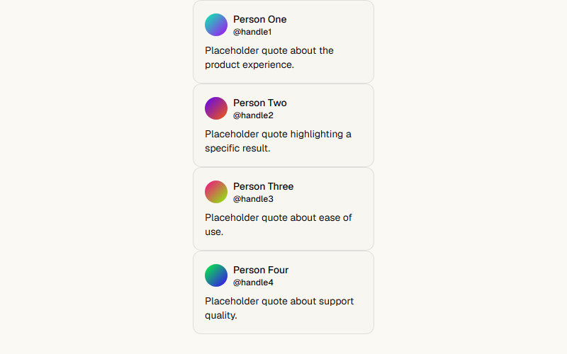
Two rows scrolling opposite directions with edge fade masks, classic social-proof section. Pure CSS animation, no framer-motion needed. Swap in real client testimonials, never fabricate quotes.
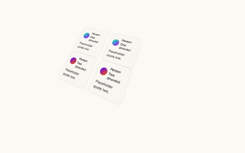
Tilted CSS-perspective wall of marquee columns, high visual impact for a portfolio or agency landing page. Heavier than the flat marquee, test on low-end mobile before shipping. Not for content-dense B2B pages.
Character, word, or line-level reveal with a dozen animation presets (blurInUp, slideUp, scaleUp, etc). Use `once` so it does not replay on every scroll re-entry. Good default for section headlines, avoid stacking more than one per screen.
Classic character-by-character typewriter effect with a blinking cursor, supports looping through multiple phrases. Works well for a rotating value-prop line under a hero headline. Keep phrases short, long strings make the loop feel slow.
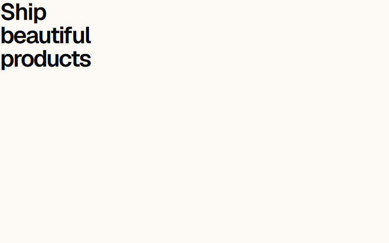
Wraps one word in a shifting multicolor gradient to draw the eye in a hero headline. Pass a custom `colors` array to match brand palette instead of the default rainbow. Use on one word max per headline, more reads as noisy.
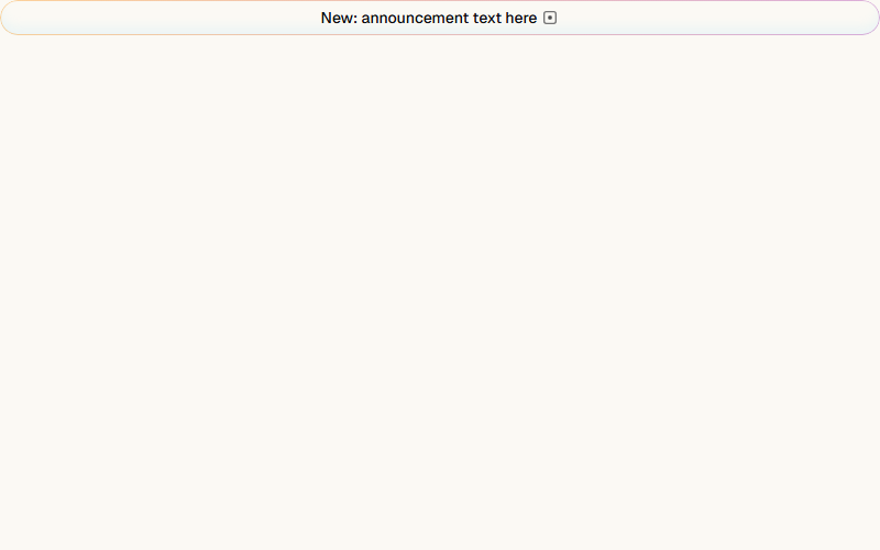
Small rounded pill with a slow-moving gradient border, standard pattern for a 'what's new' announcement above a hero headline. Pairs naturally with a chevron icon and a link to a changelog or release note.
Scrambles random characters before settling on the real text, triggers on hover by default or on scroll-into-view with startOnView. Good for a nav label or a small interactive detail, overkill for body copy or long headlines.
Vertically swaps one word at a time inside a fixed headline, common for '[Verb] your business [rotating word]' hero patterns. Keep words the same rough length so layout does not jump between swaps.
Continuous small star sparkles appear and fade around the text, best used sparingly on one badge-like word (e.g. 'Featured', 'New'). Pass a `colors` object to match the sparkle color to brand accent.
Liquid letter-morph transition between words in a fixed sequence, more fluid than a hard swap like Word Rotate. Reads as premium/techy, good for a SaaS hero, skip for a local-service business site.
Pins the section and fades in words one by one as the user scrolls past it, a common long-scroll storytelling pattern. Needs enough vertical scroll room to breathe, do not use inside a short section.
Tracks the cursor and paints a soft radial spotlight plus a highlighted border on hover, wraps around any shadcn/ui Card content. Needs next-themes for the dark/light gradient color swap, strip that if the project has no theme provider.
Animated light beams connect icon nodes to a central hub, the standard 'we integrate with your stack' section. Requires wiring up a ref per node, count on light code work to swap the icon set and node count.
A single light beam that continuously travels around a container's border, drop it inside any card or button wrapper with `position: relative` and `overflow: hidden`. Cheap way to signal 'this is the highlighted plan' on a pricing card.
Two concentric rings of icons orbiting a center point at independent speeds and directions, pure CSS keyframes under the hood. Common for a hub-and-spoke integrations section, swap in the client's own logo set.
Counts up from 0 (or a custom start value) to a target number when scrolled into view, supports decimals via decimalPlaces. Standard for a stats row (customers served, uptime %, dollars saved). Trigger once per view, do not loop.
Circular gauge that animates its fill to a target percentage, useful for a skills/completion widget or a dashboard KPI card. Set gaugePrimaryColor to the brand accent so it does not default to indigo.

Continuous light streak travels along the button's rounded border on a dark fill, pure CSS. Good primary CTA for a dark hero section, avoid pairing with more than one other animated element in the same viewport.
Animated conic-gradient border and glow, ships with a solid and an outline variant. High-attention CTA, best reserved for a single pricing page's featured plan rather than every button on a site.
Uneven-sized CSS grid of feature tiles, each tile can hold its own background visual or animation. Standard 'why us' section layout, three to six tiles reads best, more than that gets cramped on mobile.
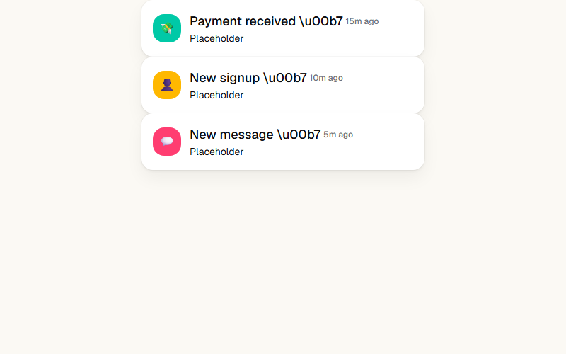
Each item slides and fades in on a staggered delay, then the list scrolls to make room for the next, loops on a timer. Built for a 'live activity feed' demo panel next to a product screenshot. Cap it at 4-6 unique items before they repeat.
Want a site built by the same team that curates MagicUI?
FWON ships full production sites in 3 weeks. No contract, no credit card.