
shadcn/ui blocks
Copy-paste UI primitives from the shadcn/ui MIT-licensed library.
Use for every primary and secondary action across the library. Six variants and four sizes cover text buttons, icon buttons, and destructive actions without hand-rolled CSS.
Base container for stat blocks, list rows, and form wrappers across the library. Compose with CardHeader, CardContent, and CardFooter instead of overriding the base padding by hand.
Standard modal for confirmations, short forms, and detail views triggered by a button click. Ships with an overlay, focus trap, and close button already wired, do not rebuild those by hand.
Switches between related content panels in place, no page navigation. Use the default segmented look on dashboards, keep to two or three tabs before it belongs in a sidebar instead.
Short hint text on hover or keyboard focus. Wrap the app root in one TooltipProvider, do not nest a provider per tooltip, and skip tooltips for anything a mobile user needs to read since hover does not exist there.
Slide-in panel for mobile nav, filters, or a secondary form without leaving the page. Defaults to the right edge, pass side to dock left, top, or bottom instead.
Small status or count label inline with text or in a card corner. Do not use it for anything clickable, reach for Button size sm instead.
Single-line text field for forms, already themed for light and dark. Pair with the Field and FieldLabel primitives for consistent spacing instead of wrapping it by hand.
Multi-line field that grows with its content via field-sizing-content, no manual rows tuning needed. Use for messages, notes, and longer form answers.
Dropdown for choosing one option from a list, keyboard and screen-reader accessible out of the box via Radix. Use a native select instead when the form is short and the extra JS is not worth it.
User or brand image with a text fallback when the image fails to load. Use AvatarGroup (same registry entry) to stack several for team or reviewer lists.
Collapsible sections for FAQs, settings groups, or long-form content. Keep only one item open at a time on marketing pages, allow multiple open on dashboards and settings screens.
On/off toggle for settings and preferences that apply immediately. Use Checkbox instead when the choice is part of a form that still needs a submit step.
Standard checkbox for form selections and multi-select lists. Pair with Label and wrap both in a Field container so the whole row is a click target, not just the box.
Inline banner for page-level warnings or confirmations that should stay visible until the user acts. Use it for form-level errors, not for a transient success message, that belongs in a toast instead.
Contextual menu triggered by a button or icon, supports nested submenus and checkbox items. Use it for user menus and row actions, not as a stand-in for primary site navigation.
Wires react-hook-form and zod validation into the Input, Select, and Textarea primitives with accessible error messages tied to each field. Skip this and use plain Field and Label if the form has no validation rules to enforce.
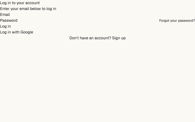
Single-card login form with email and password only. Good default for internal tools where there is no social auth to wire up.
Two-column login with a full-height image on desktop that collapses to a single column on mobile. Swap the placeholder image and company name, the form itself is a separate login-form component pulled from the same source URL.
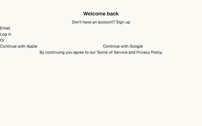
Centered login card built around one email field plus social login buttons and a legal footer. Use it when the client wants one-click sign-in via Google or Apple instead of a password.
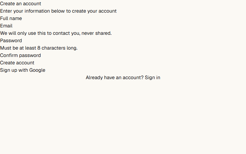
Card-based signup form with name, email, password, and confirm password fields. Swap the field description copy for the client's own password rules and privacy language.
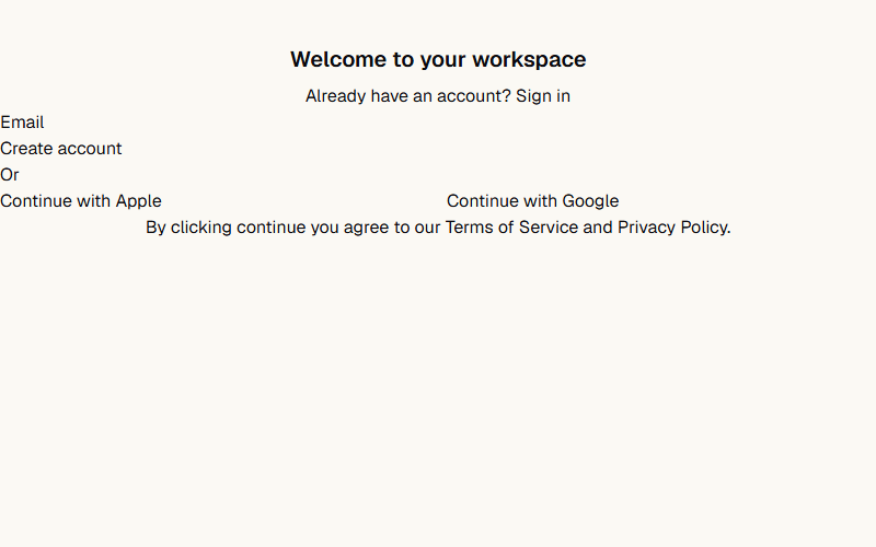
Compact signup form built around one email field with Apple and Google buttons below it. Use for low-friction signups where password creation happens later, after email verification.
Full dashboard shell: collapsible icon sidebar, team switcher, nested nav sections, and a user menu in the footer. Ships as five files (app-sidebar, nav-main, nav-projects, nav-user, team-switcher) plus the base sidebar primitive, pull all of them from the source URL, not just this one.
Want a site built by the same team that curates shadcn/ui blocks?
FWON ships full production sites in 3 weeks. No contract, no credit card.